Document Delivery and Setup
- Design
- Research
- Strategy
Exhibits capacity to iterate solutions for a growing product team while helping to build a user-first, product-driven ethos.
Project Summary
Imperial Premium Finance aimed to simplify the insurance quote process by creating a new product called IPFS ONE (previously known as “QUIVIT”). This platform would merge quotes, document signing and delivery, and multiple payment options into one streamlined experience for users.
Roles and Responsibilities
End-to-End Product Design
Starting from discovery research and requirement capture to wire-framing, prototyping, user testing, and gathering feedback from early-adopter clients.
Weekly Team Support
Provided 1.5 years of ongoing support to the product team, including regular user research, weekly feature wire-framing and prototyping, and user testing, as well as submitting user stories to an agile development team.
Design Sprint Facilitator
After the initial product development and release, the client team was led in design sprints that focused on feature development. This included designing a mobile POV for agents to create document packages, integrating APIs, and creating smart document templates.
Challenges and Hurdles
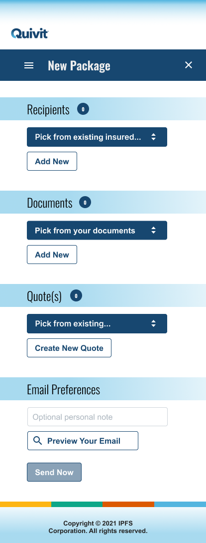
- The client originally created desktop-only screens for the MVP wireframes and user tests, (incorrectly assuming users wouldn’t complete the process on a phone).
- After initial requirements were gathered, the project needed to be reconfigured to allow for scalability beyond the initial requirements of 1-2 policy options, 2-3 documents, and a maximum of two signature roles.
- Users had difficulty understanding the signature setup requirements or template options in the context of templates and user roles, leading to confusion among beta users.
- The dashboard initially only consisted of a status list, but we added features based on what we learned about agent workflows during testing.
Impact and Key Metrics
Onboarded the first 500 paid customers to the platform.
After creating and testing the initial wireframes and workflows with users, we supported the IPFS customer success team thru the initial product launch at InsureTech 2022.
Reduced the number of “false start” transactions by almost 90%.
After the beta release, we noticed a problem with “false starts”— incomplete packages being created by agents that were never sent to an insured party. When users would start a new package and (subsequently) not finish the required setup— they didn’t know where to find the record of their package to resume the transaction setup. As a result, they just started over.
Problems
❌ Missing Features
The original project plan conceptualized document templating as a secondary feature that wouldn’t be baked into the main UI of the agent process setup workflow.
.png)
❌ Confusing Setup Process
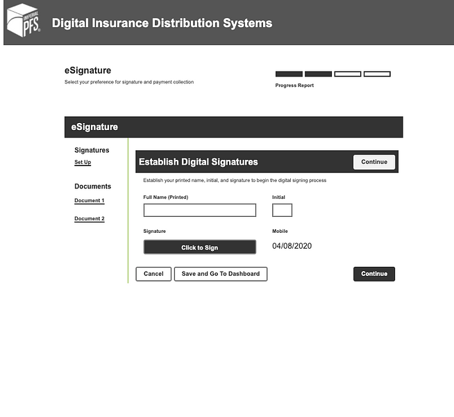
Once users started down the path of setting up a series of documents to send off to a recipient, they needed to “Set Up” signatures (left pane). They were confused by the initial UI design and UX writing that seemingly conflated the idea of “Set Up Signatures” and “Establish Digital Signatures.”
❌ Dashboard Missing Clear Process Start
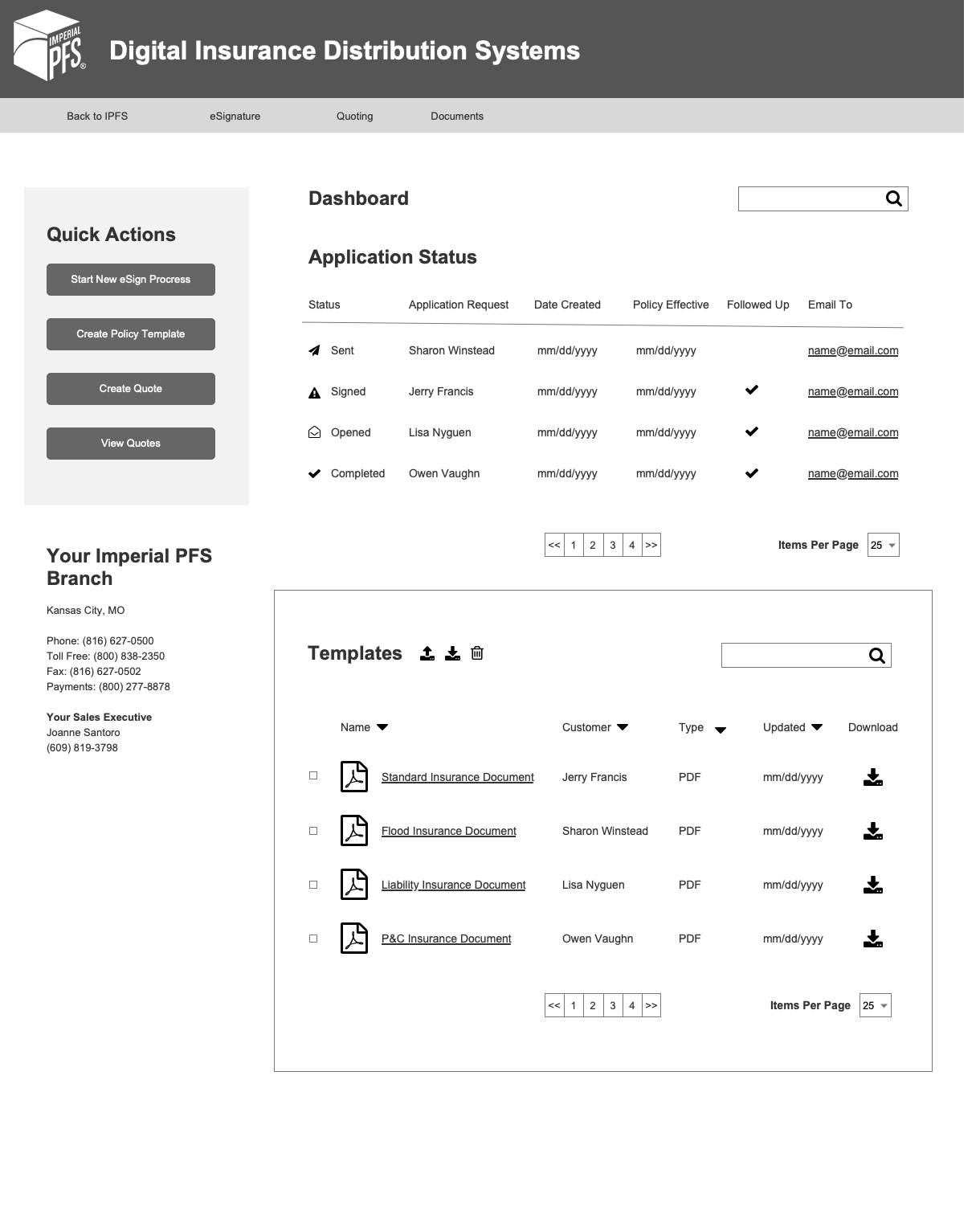
Test users didn’t feel confident with the Quick Actions presented to them on the main dashboard screen. Since the system was being designed to pair with complementary services, the business wanted to give users three different starting points— new eSign process, a policy template, and create a quote.
❌ Insured POV
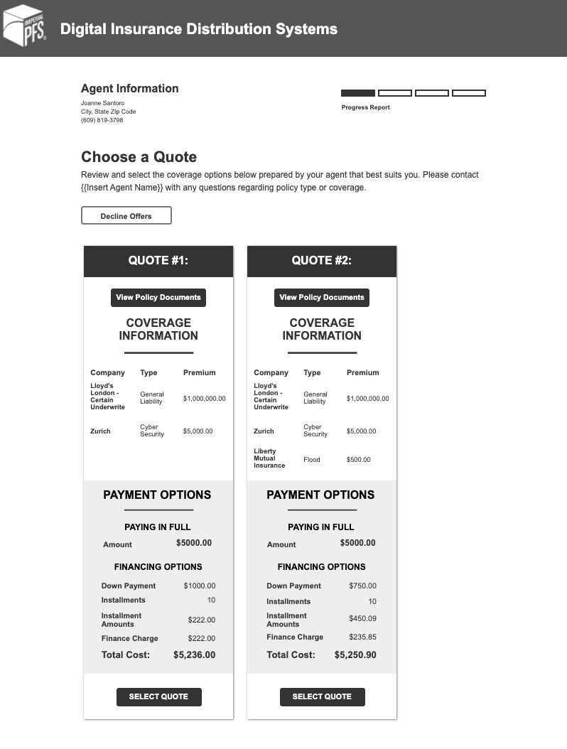
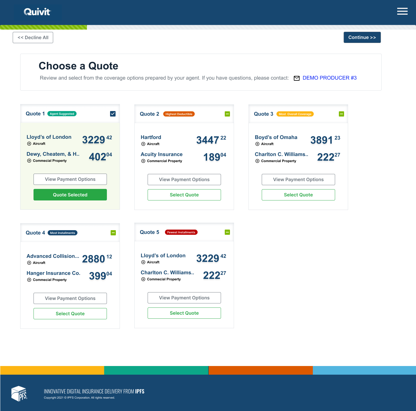
While users who received the document packages demonstrated that they understood how to select one versus the other, the system quickly became crowded when the agent wanted to send (for example) six choices rather than just two. Users also told us that they had a hard time visually identifying differences (scanning).
❌ Template Confusion
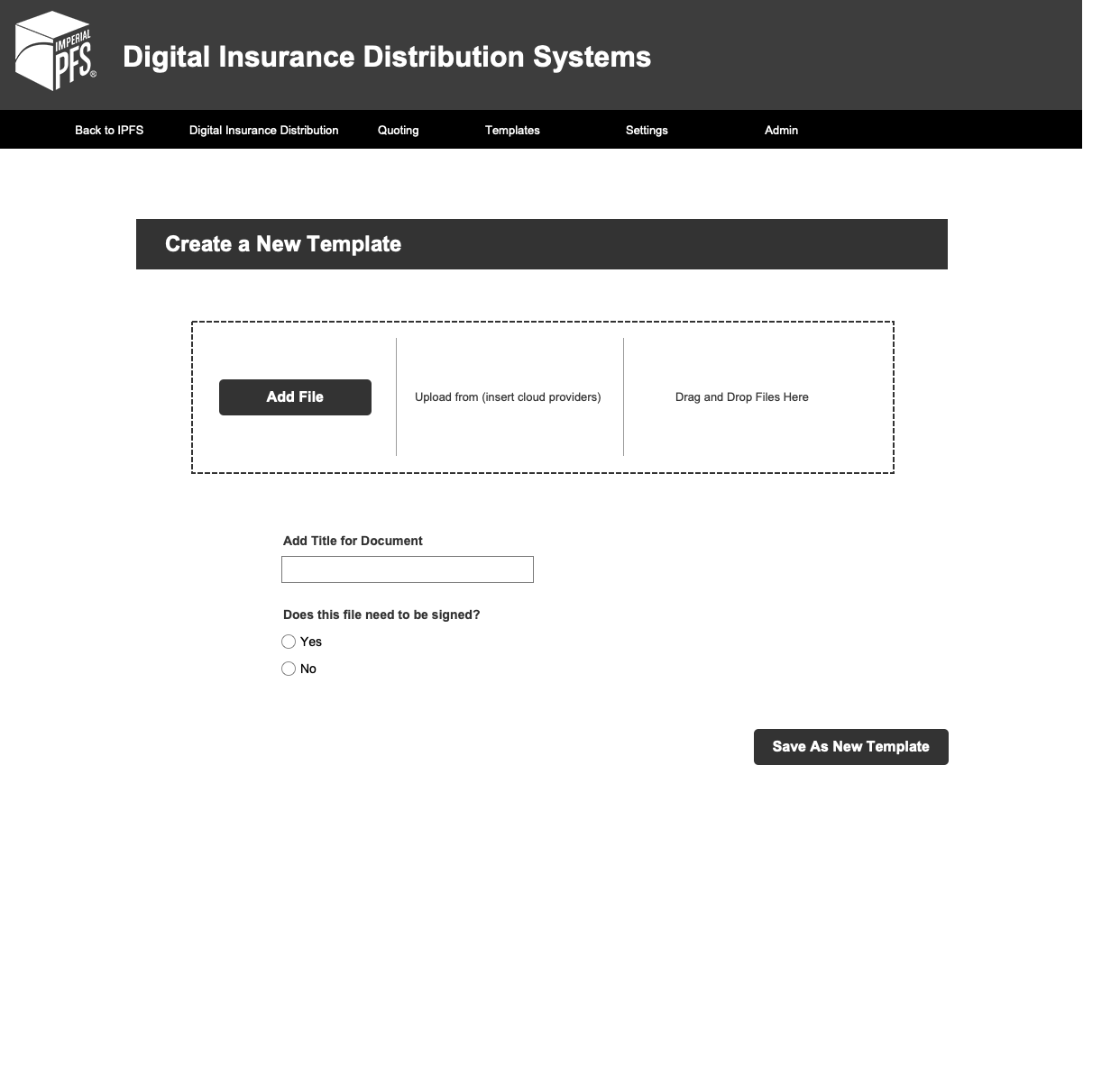
The initial prototype imagined “creating a template” as a stand-alone screen (i.e. not something that would happen in concert with a parallel process of sending a document).
Solutions
✅ Dashboard
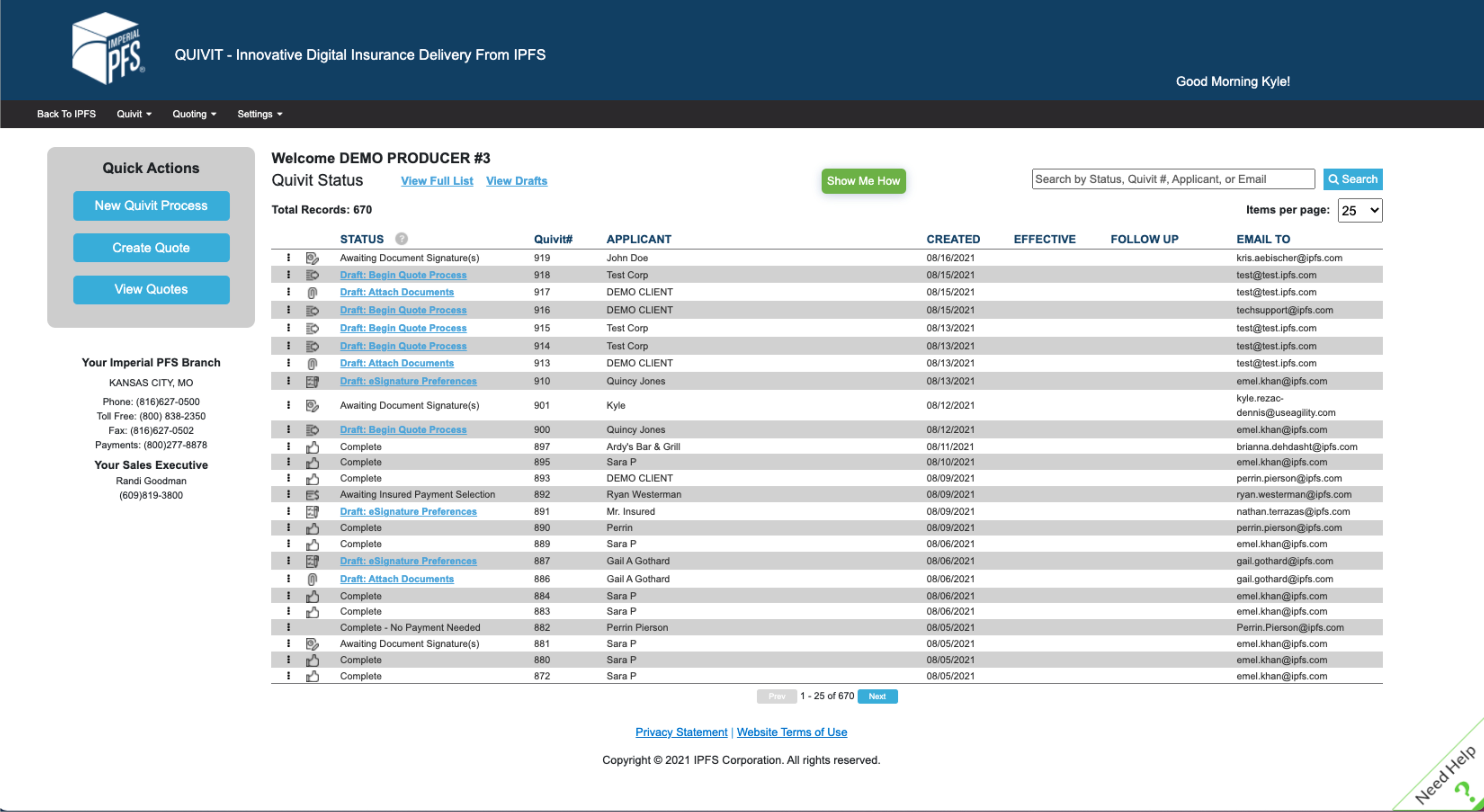
Starting with the dashboard, the design for the MVP production prototype introduced and clarified important user actions:
- “New Quivit Process” button (left pane) was responsive to user feedback about how to start a process.
- We also added functionality to each package that included a context menu to allow edits and modifications, a unique transaction ID number, an effective date for the policy (which allowed agents to sort by coverage dates), a follow-up date field, and a display of who the transaction was emailed to.
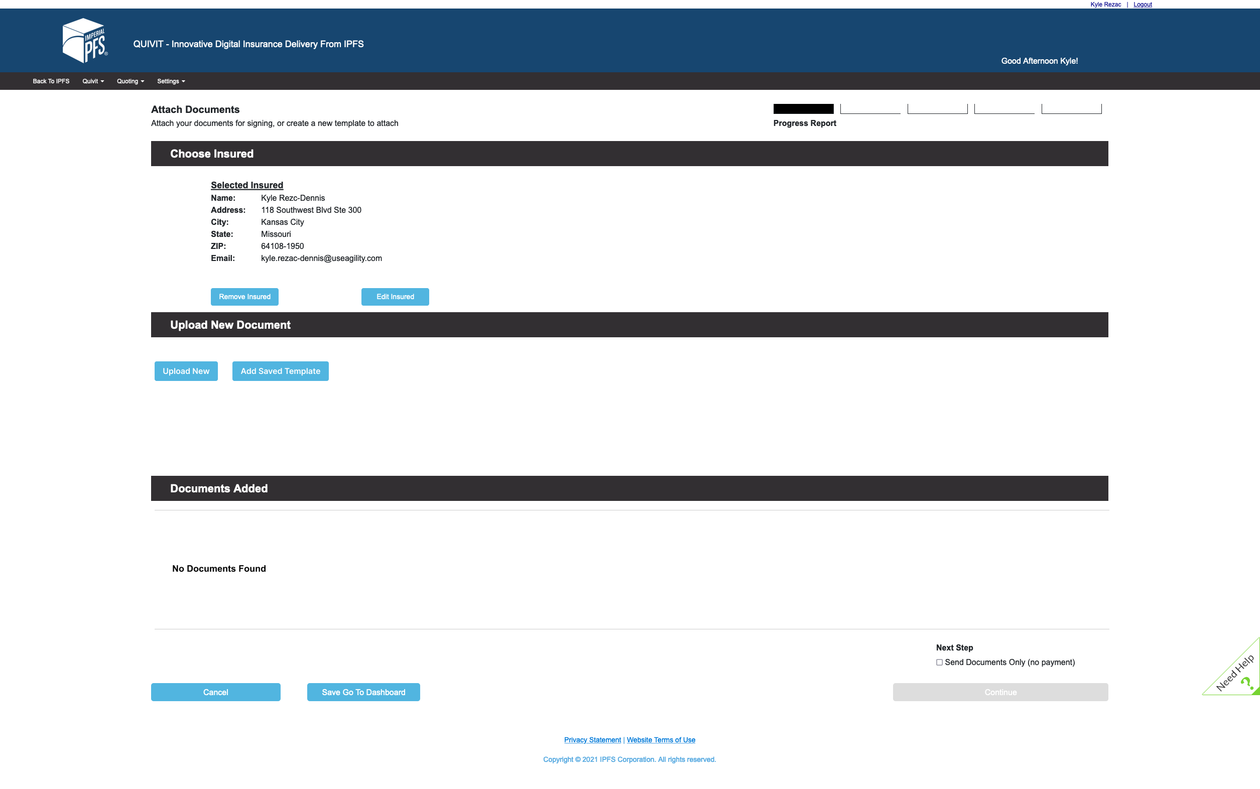
✅ Uploading Documents
Rather than taking the user to a different screen once they elected to upload documents, the production MVP allowed users to upload a new document or attached a saved template right from the process flow.
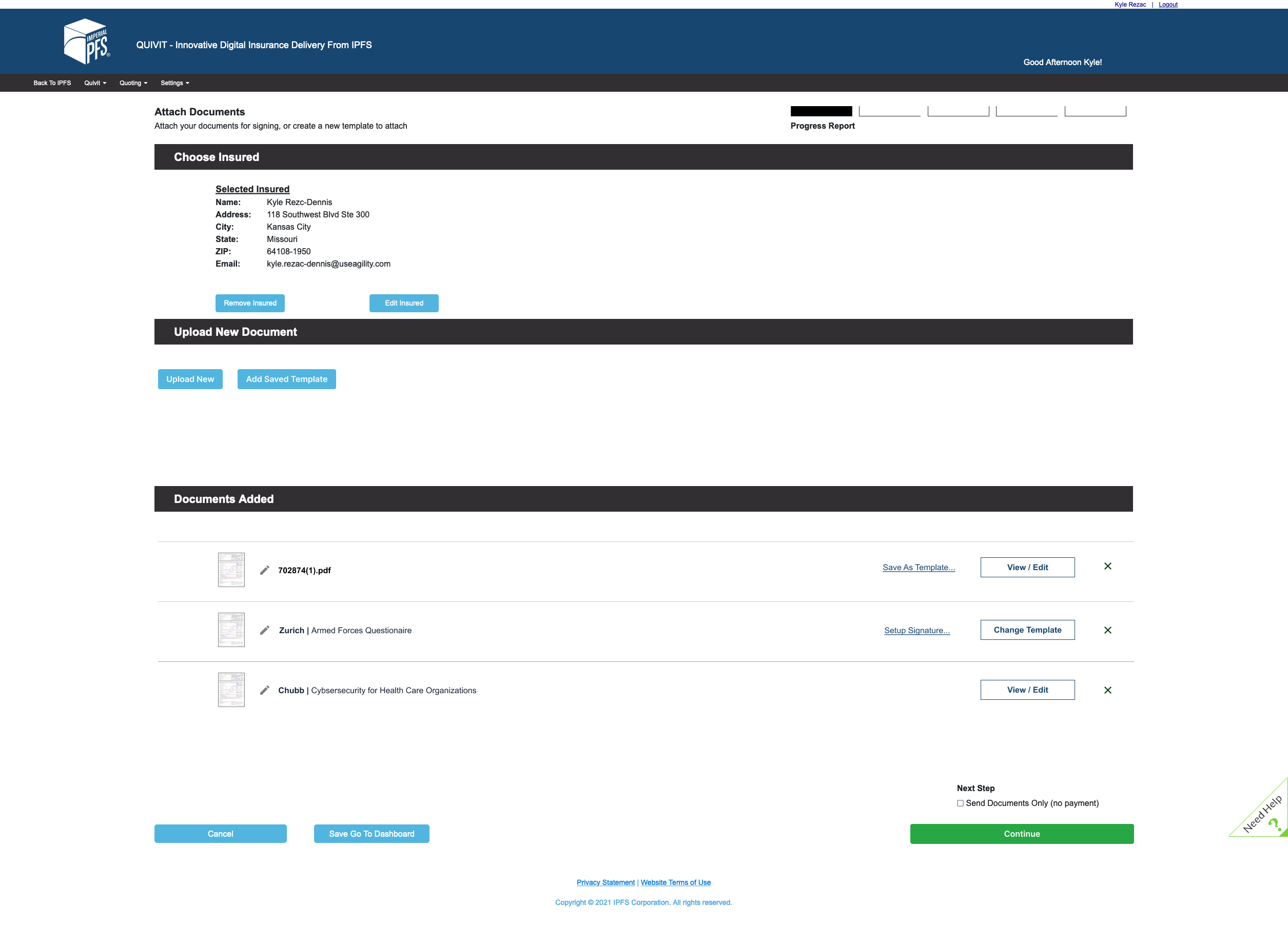
✅ View/Edit Documents
Preparing for eventual templating functionality, we modified the UI of the documents added handler to give users clear paths to (a) save a document they had just uploaded as a template, (b) setup signature locations on a document they just uploaded or (c) modify signature locations on a previously template or a recycled document.
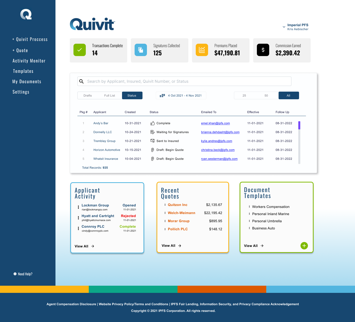
✅ Updated Dashboard
After another round of testing, we modified the UI for the Quivit dashboard to include:
- A new side-bar that more accurately reflected the two possible choices to initiate a document delivery process.
- Agency KPIs at the top of screen that would reflect number of completed transactions, signatures collected, premiums places, and commissions earned.
- Ability to sort list of transactions by Drafts vs. Active.
- Activity reports — showing which document packages were opened, rejected, or completed.
- Gave users the ability to visually identify “recently completed quotes” (in secondary system) in which users could use to begin transactions.
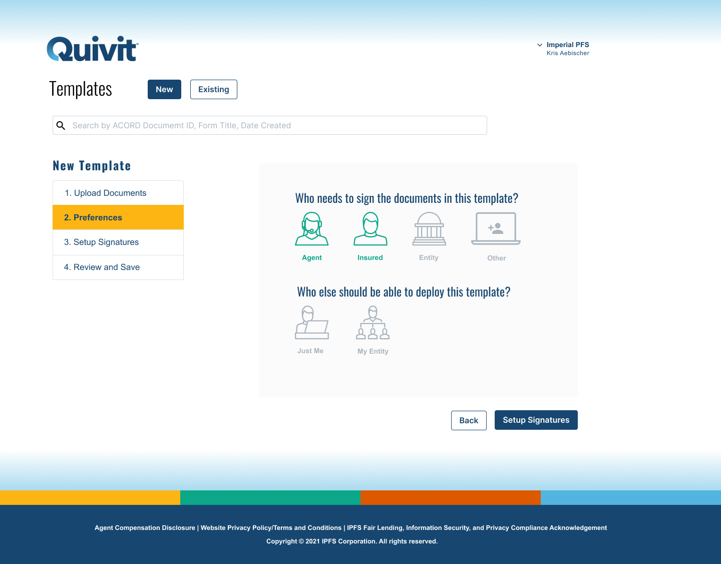
✅ In-Process View (New Template)
During the push for adding templating features (based on user interviews and our increased understand of who would be using these systems), we clarified the setup interface to make the process simpler and easier to use.
✅ Insured POV
We added clearer process indicators to the insured POV and created categories (i.e. Agent Suggested, Most Coverage, Fewest Installments, etc.) to give insured parties better and easier ways to understand the coverage options available to them.
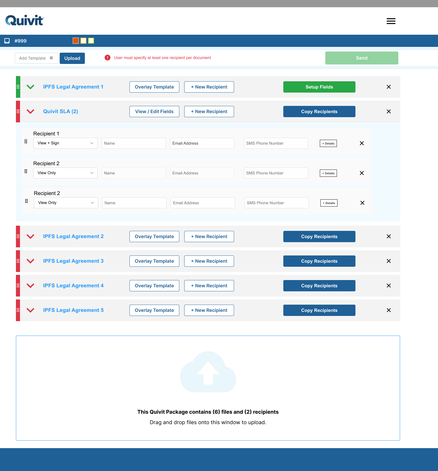
✅ Multi-Doc, Multi-Sign
In order to meet the demands of agency use at scale, the system (eventually) needed to undergo a conceptual UI redesign so that the system could be responsive to (potentially) a dozen or more documents being sent to the same number of parties. Rather than conceptualizing the insured and documents as two separate parts of the process, the final design eventually rolled them into one process where the user uploaded documents and then identified recipients for each.
✅ Mobile Functionality
Despite receiving initial direction that agents would never need to do this process on a mobile device, we heard the opposite when we user tested the MVP. In order to meet this need, we had to revisit the entire process to design a solution that would elegantly shrink a “desktop first” design to a clean mobile process.

Let's work together.
I'm currently open to project-based or full-time experience design roles working with research and strategy-obsessed teams.