eCommerce Conversion Optimization
- Research
- Strategy
Demonstrates an ability to listen to users and design solutions my team can quickly implement to score big, immediate wins with customers.
Summary
- StaplesPromo.com is a lean spin-off of Staples.com which allows users to order branded versions of various traditional promotional products ranging from office supplies to event swag and custom t-shirts.
- Worked as the Lead UX Researcher directly with a small team that included a client-side project manager, a front-end developer, and an eCommerce conversion manager on a project aimed at increasing a promotional product site’s overall conversion rate.
- After completing behavioral research with frequent promotional item purchasers, we established frequent tasks that we knew promotional product buyers would need to complete on a promotional products website and performed usability testing using the SPP site (as well as three common competitors).
Success and Key Metrics
This research project helped the SPP team surpass site conversion rate targets.
- Based on the implementation of these research findings, SPP was able to get the overall conversion rate for direct traffic from a 1.7% to almost 5% increase (320%) within six months.
- The project also showed achieved a similar increase in Google or Paid conversions— from .6% to 1.5% increase (nearly 300%).
Challenge
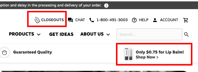
❌ Crowded Site Header
.png)
Users immediately got the impression that the site was there to sell them something rather than authentically to help them achieve their goals of finding the right product they needed. We repeatedly observed users missing key content like “Help” and many were unable to locate basic information about the website (like their cart, search, and the phone number for the SPP order support team).
❌ Extraneous Information

Users also thought there was a lot of extraneous information they didn’t need. They described these “selling point” elements of the site as “par for the course” and said things like:
- “What’s the point of all of this?”
- “Who’s charging for setup? That’s not really even a good selling point anymore. Plus, I’m always bringing my own art anyway. Anybody charging a setup fee is just ripping us off.”
- “What’s a free shipping offer? That must mean I need to buy a certain amount, so that’s just telling me that shipping isn’t free on most items,”
- “Of course, the quality should be guaranteed, I’d expect that anywhere I was purchasing”
They especially questioned why this type of information was presented to them in the site header.
❌ Featured and Closeout Items

Users near-universally expressed skepticism about featuring low-cost featured items. Almost universally, they assumed they were the lowest-cost, high-margin items and felt like the site was trying to “push” cheap items on them.
It caused them to view the site as manipulative and they (overall) associated features like this with less trustworthy sites that sold lower-quality items. Additionally, users almost universally told us that (if they were shopping for promotional items) they would never make an impulse purchase— they always had an agenda for their purchase before they visited the site in the first place.
❌ Shop All Products
%20Expanded.png)
Users helped us to understand that the primary product dropdown lacked sufficient text spacing for scanability and included too many subcategories.
We also discovered that users had difficulty locating the “View All” option at the top because their instinct in using the mega menu was to scroll down, which omitted the “View All” part of the screen from view on most desktop devices.
❌ Mobile Navigation
.png)
.png)
When we asked users to perform tasks on mobile, the already crowded navigation felt even more crowded, lacked sufficient space for click areas, and generally necessitated a menu structure that was overwhelming. When we were able to get users to navigate to the product sections, the menu frequently exceeded the viewable area on their devices.
When users needed to close the menu, they often couldn’t figure out how. The menu also violated an expectation they had to further see categories “unfurl” (i.e. Men’s and Unisex Apparel” should have subcategories on the menu, not just immediately take them to a full list of search results). This was an interaction pattern that other promotional product websites easily met.
❌ Landing and Hero Area Lacked Shop-First Design
.png)
Users responded negatively to customer loyalty-focused content (like Signing up for a VIP program) by saying things like:
- “I would never sign up for that— I haven’t even found an item that I want yet”
- “Free shipping shouldn’t be something that I have to sign up for a special program to get, that should be for everyone.”
They also found the “Shop Promotional Product Collections” to be confusing when they said things like:
- “What’s a collection? Is that like a list of stuff this site wants me to buy from? I already know what I need, I just want to find it.”
- “What’s ‘New Hires’…oh, they must be saying there are some gifts I could buy for someone I’m hiring, but that’s not what I’m here for,”
- “I have a set budget, but we’ve already usually decided on the item we need, it’s never really crossed my mind to shop for items under a certain price point— I can see why that might be useful, but it’s confusing with the icons here.”
Users also found content like, “Top Selling Promotional Products” to be overly focused on what other people had bought, not focused on what they needed to purchase.
Solutions
✅ Addition by Subtraction

Simply removing content from the header for which users had no immediate use went a long way to cleaning up the initial presentation of the site.
Deciding to keep only one reference to “discount” or “sale” items in the header also helped eliminate the cluttered look and feel.
The new design also folded contact information that cluttered the design under a “Contact Us” menu that replaced a completely useless “About Us” section that users didn’t find necessary or helpful.
✅ Baked in Additional Information

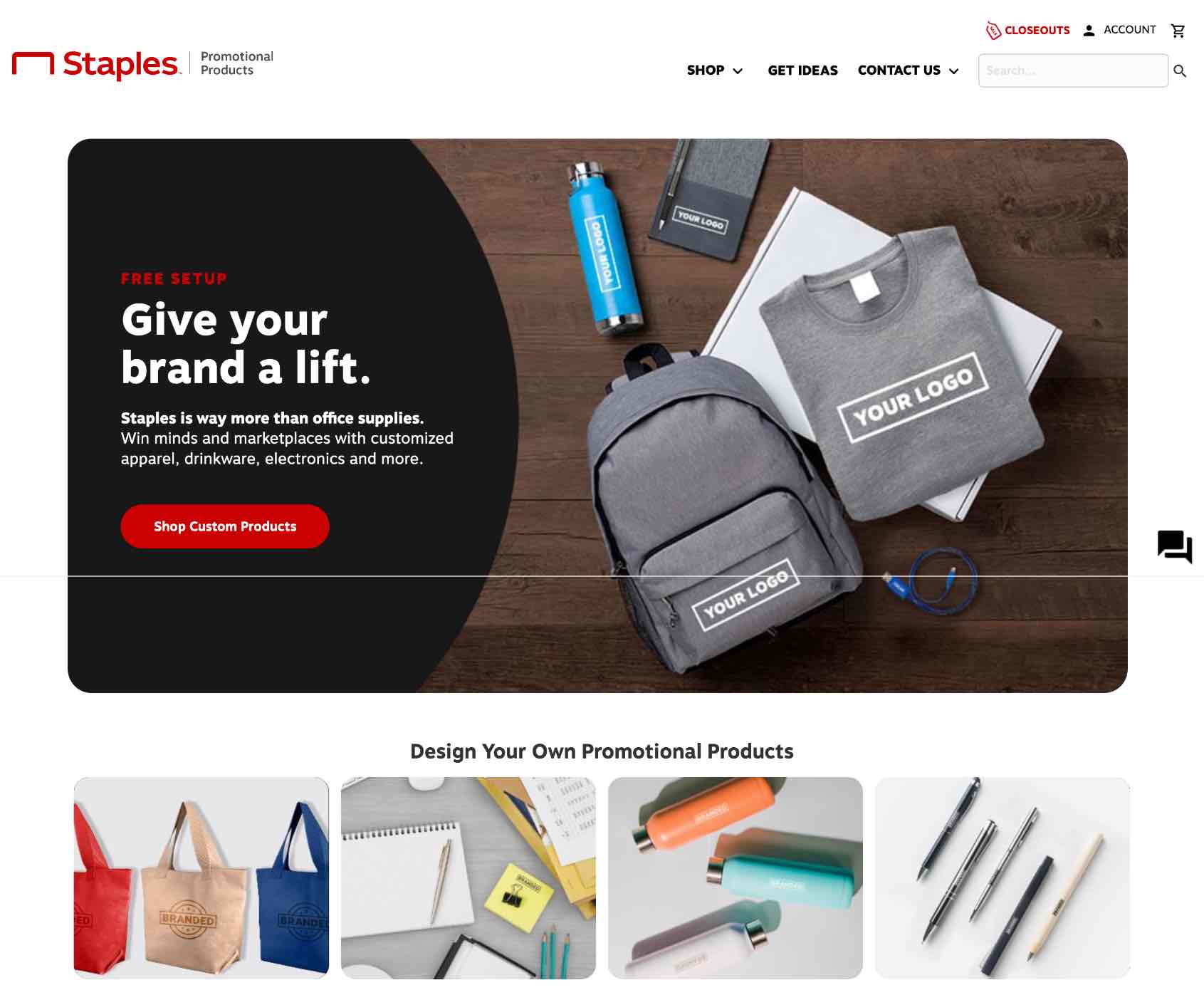
Instead of shoehorning a marketing message into the splash area, the research produced the argument for an actionable, usable CTA that would navigate users to an “All Products” menu as quickly as possible.
In order to maintain business (marketing) goals, the new design kept references to some items like “Free Setup,” instead opting to present that information as part of the main splash image for the site.
✅ Mobile Focused-Design
.png)
.png)
Both instances of “Shop” on the new home page navigate users to a list of available custom product types that are no longer presented through the display of a massive, unusable list.
Instead, categories unfurl logically to include the most common categories revealed in user research (i.e. “Events and Tradeshows” was the top reason for visiting a site like this, “apparel” was second, etc.).
✅ New Desktop Mega-Menu Design

The new desktop menu design focuses on a shop menu that features fewer categories (i.e. no subcategories for items), better spacing, and a relocated “Shop All” feature.
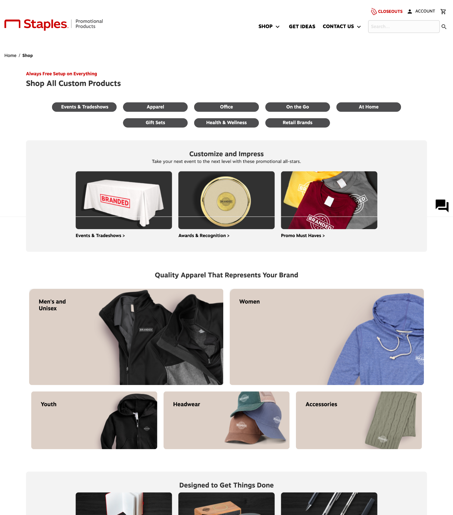
✅ Shop All

Previously, when users select “Shop All”, they were directed to a page that literally returned a search for all in-stock products. The new design featured a purpose-built page that lets users explore all available products using strong visuals, clear item category displays, and stronger (and more usable) item selection criteria.
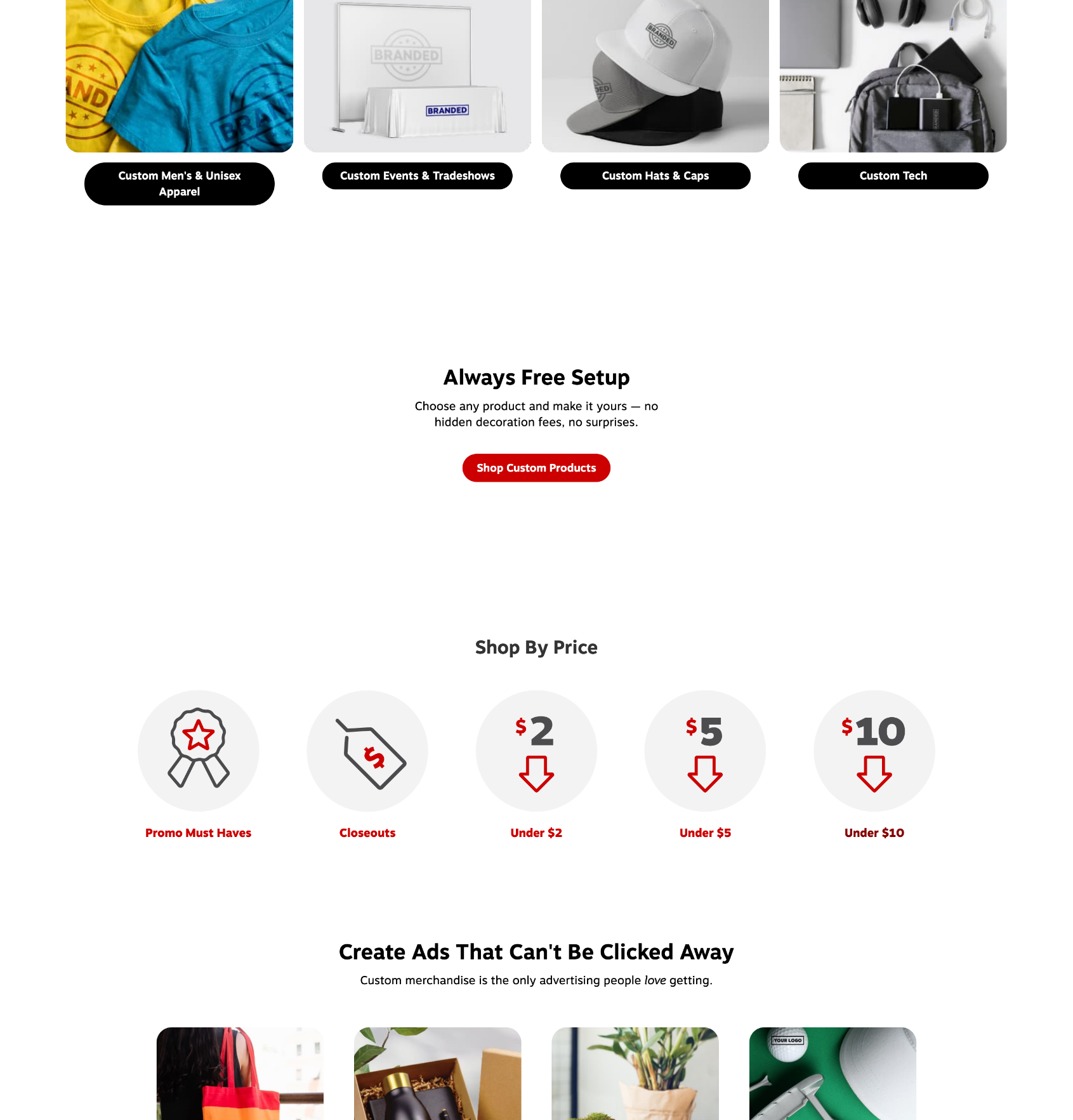
✅ Shop By Price

Users said they didn’t have much use for the “pre-furnished collections”, but feedback did cluster around (at least some interest in) being able to quickly filter all of the promotional items on the site by price via a simple user journey from the home page. The new design introduced a new user flow that supported the ultra-low-cost items that were previously featured in the site header.
Extended Research Notes
Customer Discovery and Psychographic Research
This project included conducting hour-long mixed-method discovery research sessions (15) with selected users designed to enrich the client’s understanding of site user motivations and contexts.
Business System Analysis
The project necessitated the review of IT infrastructure in the context of customer needs and business goals, evaluated procedures and priorities, and suggested workflow and UI improvements.
The first task that we completed was an evaluation of an existing User Journey map that had thus far informed the work of the product team— a journey map hadn’t been updated since the promo products team was spun off from Staples.com and challenged to stand up the promo products site.
We reviewed a list of 21 customer needs and goals currently showcased on the existing Customer Journey Map and placed them into two categories— purported emotional needs and goals users (i.e. users want to feel like they made the right choice) and business-focused expectations or goals (i.e users should be able to easily make an account).
We did this in order to create a research strategy that would allow us to collect feedback data about customer preferences in a way that might most significantly advance the team’s understanding of their core customer.
Each area of the customer journey was divided into phases (awareness, consideration, decision, purchase, adoption, retention, expansion, loyalty, and advocacy). We arched our research strategy around exploration as to whether or not these were even the correct categories of the customer journey— we had no evidence to support these categories were anything other than traditionally understood business goals.
We extracted the “We will…” (customer promise) statements from each journey segment and performed a mixed-method heuristic evaluation of the website in that context. We evaluated the degree to which the current site was meeting its existing commitments using categories of (Low/Moderate/High/ Cannot Evaluate).
We did this in order to establish a baseline to find areas of the customer journey that needed further research and evaluation as well as to establish parameters for user tests and to focus the hypotheses we would test.
Project Impact and Key Metrics
Traffic Volume
General site traffic was up, but the conversion rate didn’t follow. A large number of users regularly gave feedback to the site analytics tool that indicated they meant to navigate to Staples.com.
In general, there seemed to be some cross-boundary static being produced by a lack of coordination between Staples.com and SPP SEO teams that led to certain search results (i.e. custom printing of things like business cards or other in-store printing needs) being directed to SPP.com (which, in fact, does not sell those items).
Conversion Rate
The primary goal of our project was to increase the overall conversion rate of the site—in this case, the ratio of the total number of people who make a purchase on the site compared to the total number of site visitors you have.
Typically, a good conversion rate for an eCommerce store would be anywhere from 2.5-3.5%. In this case, the team set the six-month goal higher than the industry average because users nearly uniformly discussed that (if they were going to the website) they were doing it to place an order.
AOV
The average cart value was $571 going into the project— the team had a goal to increase it to (at least) $600 which we met within the six-month. After the first round of User Interviews, we learned that users commonly had a set budget coming into the transaction— which complicated the fact that the site could engage in much flow-based upselling at all.
If we wanted the average cart value to be higher, we had to convince the user to select higher-margin products. This research helped the business challenge the notion of whether or not AOV was even the correct metric; instead, the team began to evaluate the order value via a true cost of goods (i.e. profit margin) versus the total value of each cart.
Bounce Rate
We knew that anywhere from 65-80% of site visitors bounced within the first two minutes of viewing the site, so we decided to focus on immediately impactful UI upgrades like navigation, and featured products. The Staples team wanted quick, cost-effective recommendations for ways to optimize the UI for speed and overall load times without losing the elements of the existing customer journey that were already working.
Challenges and Hurdles
Constraints of eCommerce Checkout Handler
Given the parameters of the current payment processor, SPP had to collect credit card information in order to collect shipping information— it was outside of the technical control of the SPP team.
User tests revealed at least one very obvious experience hurdle— purchasers wanted to know their total item cost (door to door) and exactly when the item would arrive BEFORE they entered their credit card information.
This feedback was near universal, with severity ranging from, “I would never buy anything from this site because of this,” to “I would feel like I needed to call and speak with a human before I completed the checkout process.
Significant Budgetary Limitations
As has been mentioned before— this project is as close as you can get to a “bootstrapped” corporate project; it’s a small and mighty team being asked to stand up a spin-off site using many of the same eCommerce frameworks as the existing Staples.com site (but often with less flexibility and limited direct applicability to the promotional product arena).
The client was only able to secure executive support for 15 research interviews occurring in the context of a four-month research retainer. When the research support timeline was up, the project was over.
We had so much more that we still needed to understand, but the project (functionally) ended since the team needed to have their front-end developer prioritize and execute evidence to corporate managers that the UX research and proposed site modifications had value before more research work could resume.
Thanks for reading. Questions?
If you have any questions about what you’ve read, please contact kyle.dennis@hey.com
Let's work together.
I'm currently open to project-based or full-time experience design roles working with research and strategy-obsessed teams.