Payment Collection Platform
- Design
- Research
- Strategy
Illustrates an ability to understand user needs in a specific context and produce a solution that solves multiple problems at once.
Project Summary
Users of an established premium finance insurance delivery solution (independent insurance agents) wanted to send payment information to clients without using the default email template produced by the system manufacturer. Although the tool already gave users the ability to perform this action, many reported process errors or confusion.
Roles and Responsibilities
This project was completed as part of an ongoing (monthly) retainer agreement for Imperial Premium Finance, serving as the Lead UX designer and liaison to their product team for 24 months.
The Challenge
❌ A Confusing Process
In the production system, the users would select “I will email the insured,” which indicated their intention to manually send a payment link to the insured party themselves. The system would generate a unique URL where the agent could send their insured in order to collect payment and bind the policy.
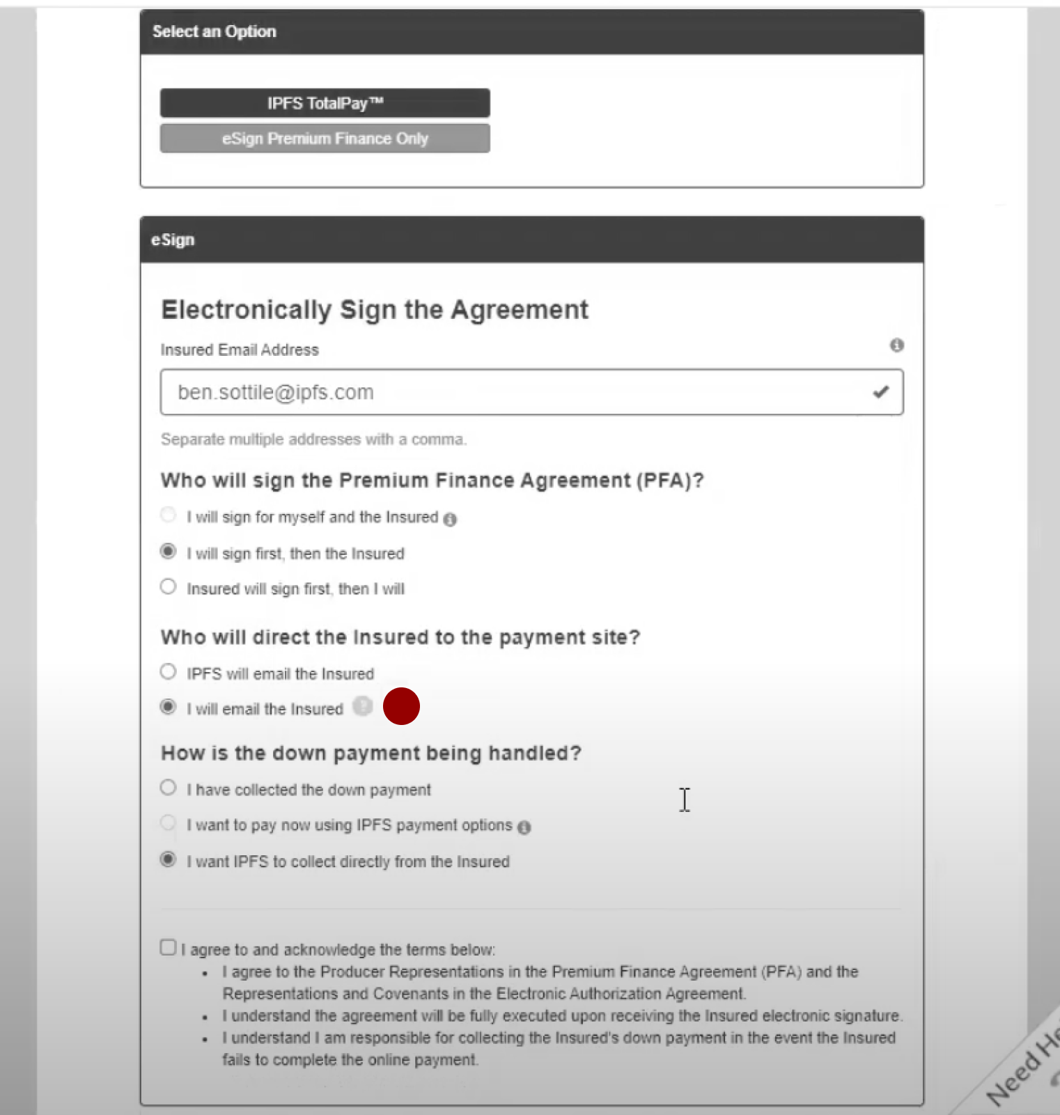
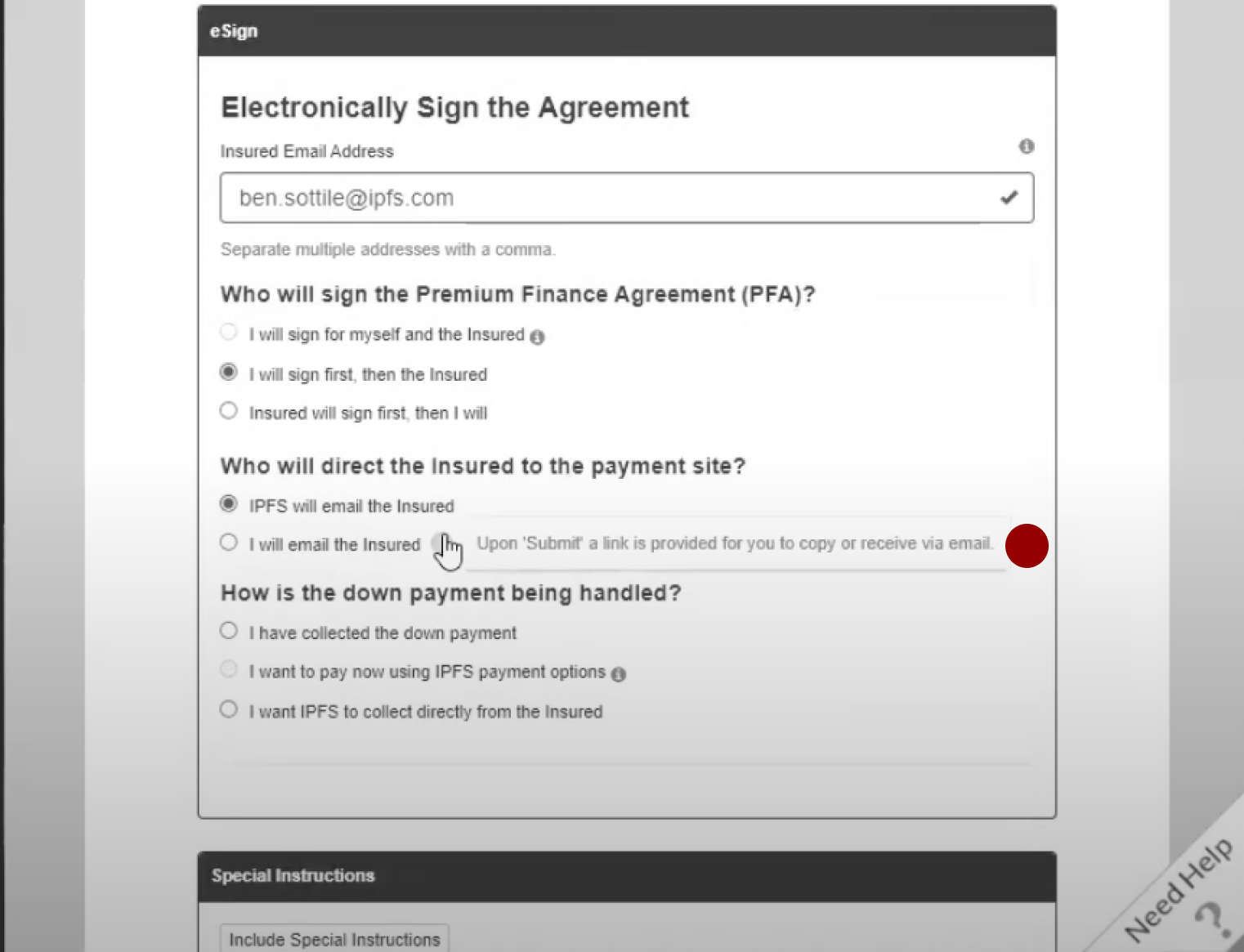
The system required the user to hover over a tooltip in order for new users to fully understand the next step in the process— in other words, the design wasn’t creating a strong expectation for what came next and the user couldn’t predict the system response once they clicked [Submit] at the bottom of the page.
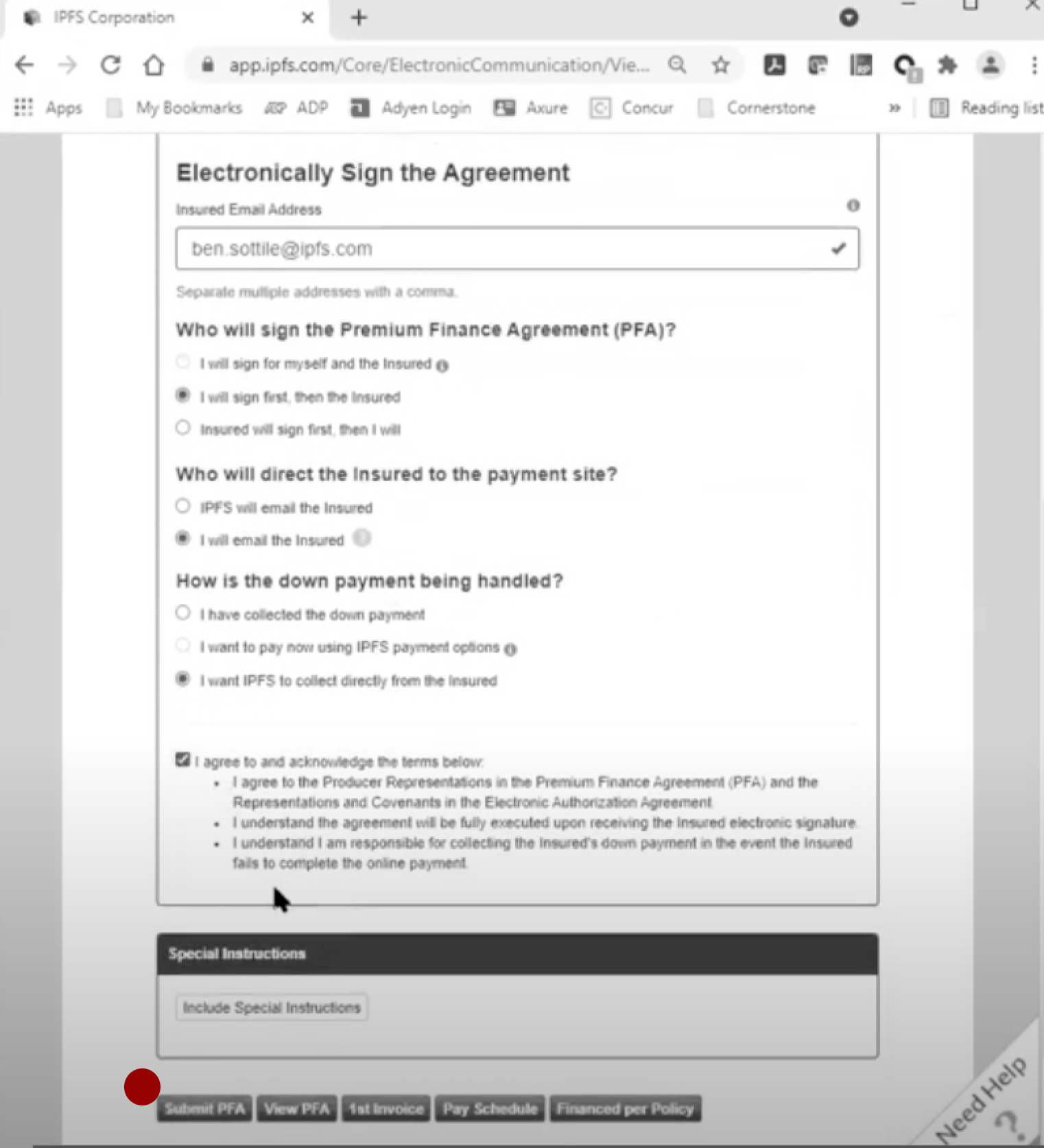
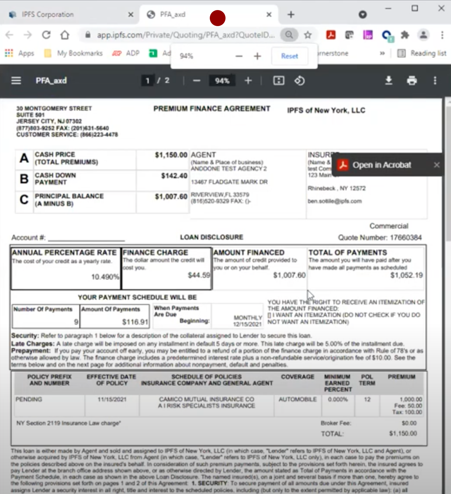
Once users clicked [Submit PFA]…
The premium finance agreement opened in a new tab.
Many users didn’t recognize that a new window had opened.
All users told us they didn’t need to see a draft premium finance agreement at this point in the process because their insured party was yet to bind coverage and many would choose not to finance.
As such, many users believed the system had failed because there wasn’t immediate evidence that a link had been produced. In some cases, they abandoned the process entirely.
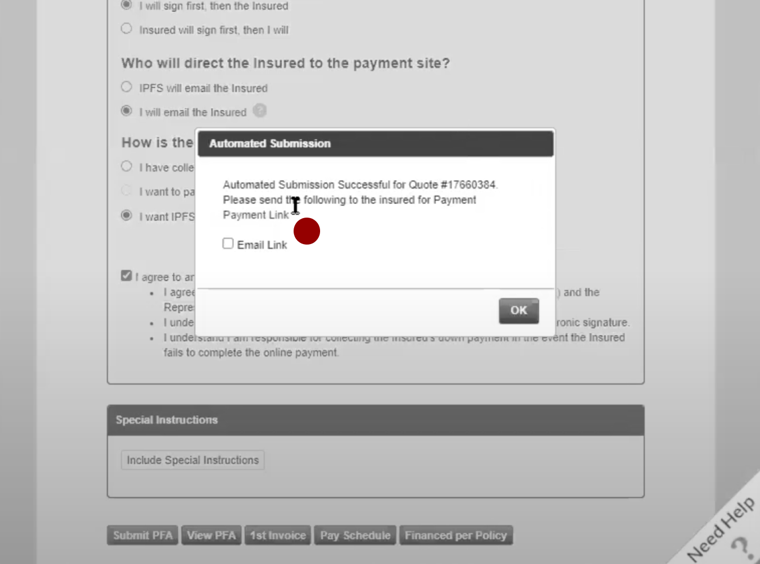
Once they clicked [submit PFA] users were given a modal screen (on their original tab) which (a) notified the user that their Automated Submission for the Quote # was successful and (b) gave the user access to the link to copy/paste and forward to the insured party.
Additionally, users didn’t understand what action the “email link” checkbox would perform.
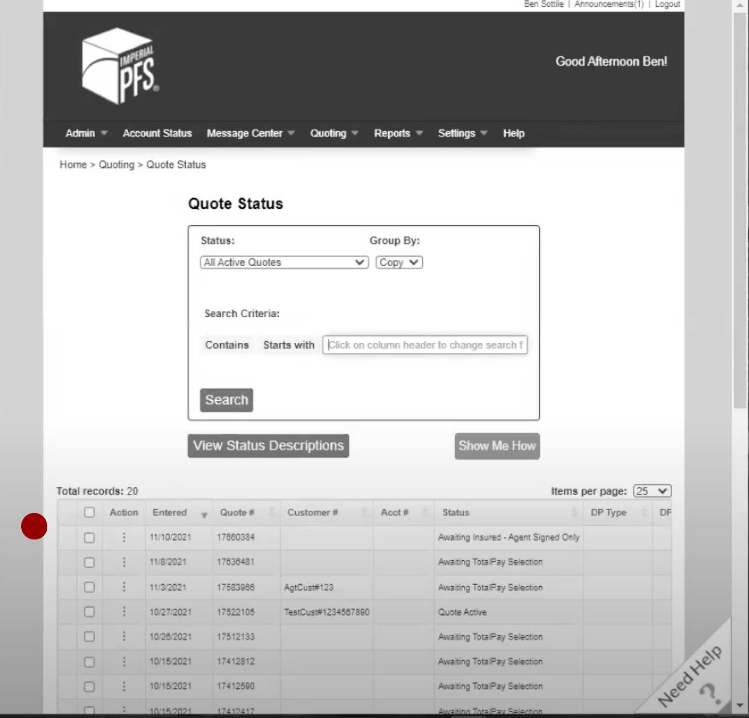
Once the user clicked “OK” the system would return them to their Quote Status screen and they would see their transaction history.
Many users would mistakenly click [OK] before capturing the link.
Users who closed out of (or abandoned the process) would return to this dashboard which (in this release) did not (yet) give them the ability to re-generate the link in the action menu.
The Solution
.png)
✅ Making the Process Clearer
The final design made the success screen a stand-alone, final process screen. The design also gives the success message more visual prioritization by using an H1 instead of paragraph text.
✅ Removing Unnecessary Steps
The complete solution included working with the development team to modify process triggers to remove the activation that opened the Premium Finance Agreement in a new tab for all versions of this page.
✅ Modifying Copy/Paste UI
The design also added a clearly labeled “Copy Link” Button and included a clickable magic link that would copy if the user clicked any part of the URL.
✅ Added Functionality
We worked with the development team to introduce a new feature (that was more responsive to the true use case and better solved a user need) which opened a blank email in the default email client that included the link and a suggested email subject. We also added an option to capture the link from the action menu in the dashboard (above).
Let's work together.
I'm currently open to project-based or full-time experience design roles working with research and strategy-obsessed teams.