Self-Service Business Intelligence
- Design
- Research
- Strategy
Exhibits an ability to listen to technical, data-driven experts and simplify their insights into practical procedures that can benefit the wider organization.
Project Summary
We helped a team working on a business intelligence strategy project (in the context of a corporate merger) implement better data governance standards. We were asked to confirm that users had trouble navigating the system and design a standards guide to be used for the ongoing deployment of a self-service data governance and deployment model.
Challenge
The adoption of PowerBI (supposedly) served as a support tool for workers at KCSR to execute a precision railroading strategy to move freight. The company began building PowerBI dashboards in 2018 to help employees get the information they needed to facilitate day-to-day decision-making. Executives’ time was limited, so they couldn’t wade too deeply into the daily data— they needed clean, approachable daily summaries.
The primary hypothesis of the ITBI team was that business users couldn’t find the reports or data they needed within the Microsoft PowerBI system (i.e. system navigation and information architecture). Their secondary hypothesis was that (when they did find what they needed) the dashboards lacked consistency and visual design to be usable.
Roles
Document Review
The ITBI team had previously attempted to create a KCSR user guide for PowerBI, but it hadn’t been adopted by the business closely enough to make much of an impact. Because the ITBI User Guide was to be created in the context of a “Self Service” BI strategy, we also reviewed training schedules, business rules, and other system documentation.
Our initial task was to collect, annotate, and make markup suggestions on all of the existing organizational documentation related to the PowerBI systems. This methodical review helped us to frame the questions we need to ask the Business and IT stakeholders responsible for deploying all of the connected data into the system.
Stakeholder and User Interviews
In order to ramp up the project, we completed one semi-structured stakeholder interview with each member of the ITBI staff (4 users) and one follow-up session (to receive additional feedback) that included the whole team. We completed a dozen user interviews with KCSR staff ranging from railyards in Mexico to Kansas City.
When our initial round of research couldn’t find confirmation of the ITBI team’s hypothesis about the information architecture of the BI system, we completed a follow-up contextual inquiry round with additional executives and managers.
Results
Research Findings
- We didn’t confirm the ITBI team’s initial hypothesis— not a single user said (or showed) they had trouble navigating the dashboard listings (i.e. locating the correct dashboard)
- We learned from users that their biggest friction point was that they didn’t trust many of the data sources that were piped into the BI system— i.e. they believed the data wasn’t properly cleaned, comprehensive or complete, and supplied in a way that would be reliable and uninterrupted.
- Business users felt like the system included dozens of dashboards that should either be (a) cleaned or (b) decommissioned— although nobody actually feared employees would make decisions informed by faulty dashboards— the organization simply hadn’t adopted the tool at a level that would produce that concern.
- We also learned that the perception of business users was that the ITBI team had created governance procedures around the BI system that was too restrictive and prohibited users from solving their own business problems— users needed advanced permissions to make new dashboards or alter data sources; lacked the capacity to keep their most-used dashboards up to date; and overly relied on the ITBI team to build dashboards for them.
Self-Service Dashboard Templates
- We found (near-universal) frustration with the UI of the dashboards themselves— if anything was making the dashboards unusable, it was their design. For a company that was doing this project in the context of a very public merger, the lack of standards and consistency provided a perceptual problem as much as anything else.
- The last stage of the project was to use everything that we learned and create a standards guide for new and existing dashboards— the document included carefully selected colors, fonts, naming standards, and drill-down principles, in addition to three editable template options.
Solutions
❌ Before
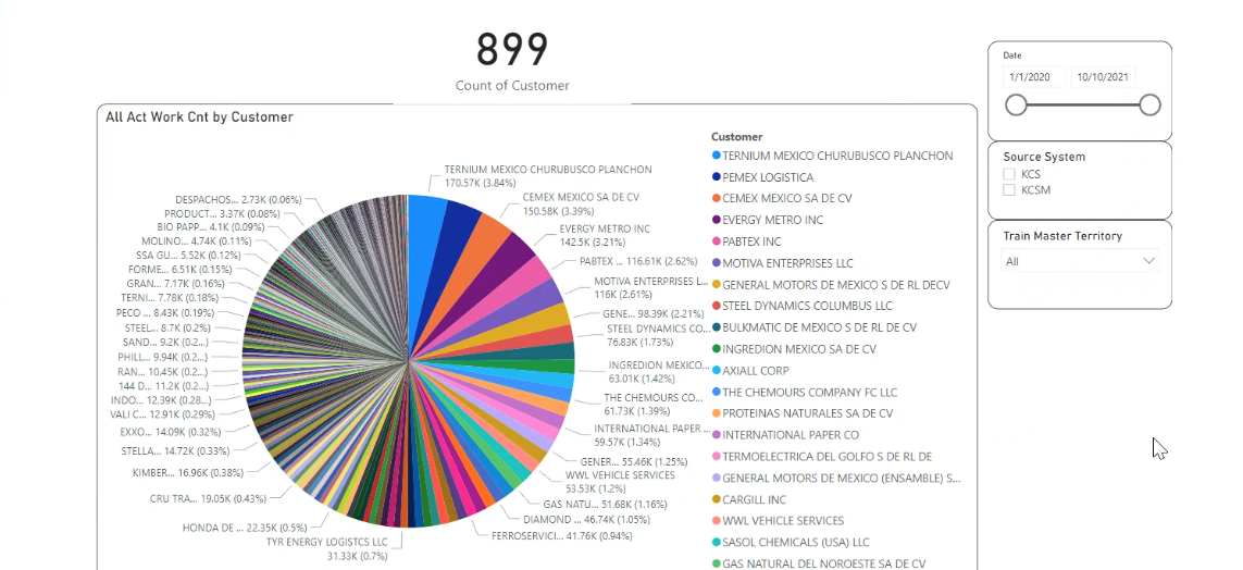
Business users were outright misusing BI tools to produce reports that paired data with the wrong built-in visualization options; they were also inconsistently locating filters from report to report.
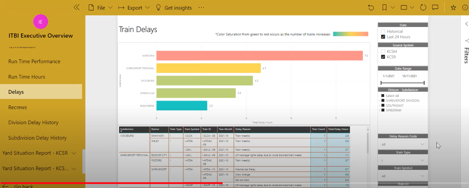
Even when power users were able to create dashboards that were somewhat usable, they were still inconsistently applying brand standards to basic elements (like the KCSR logo, a short description of the data included in the table, etc.).
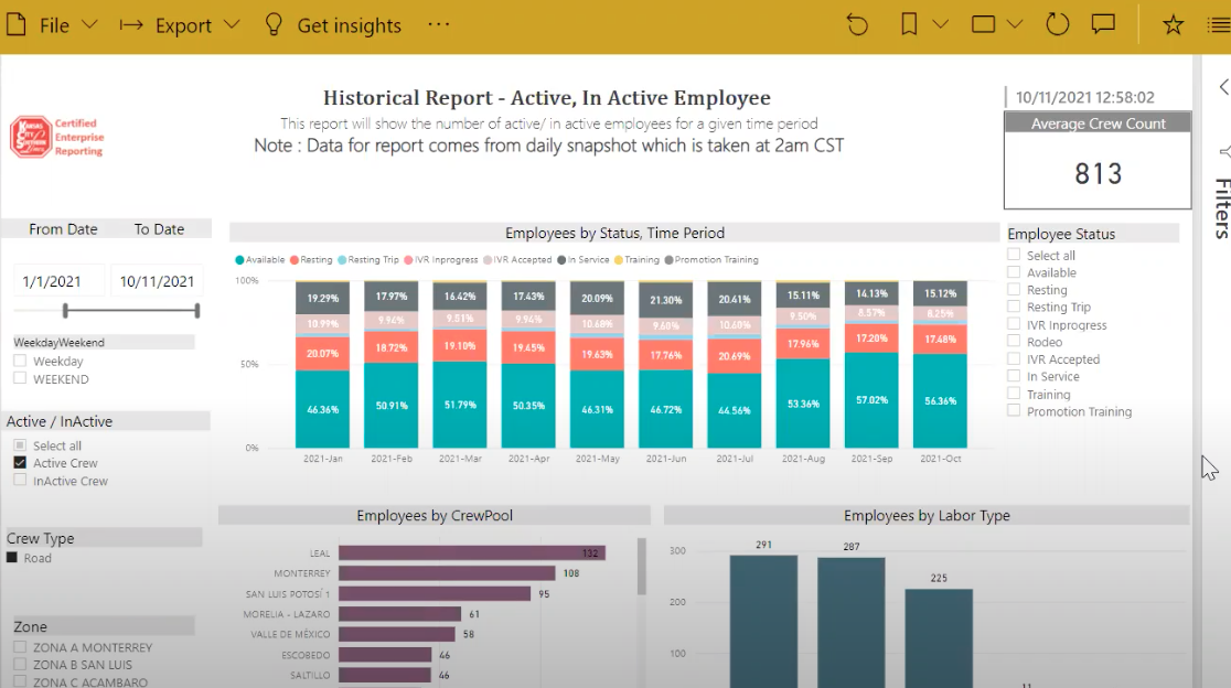
And inconsistently applying design elements like applying alternate colors to rows.
And while some reports made efforts to follow the existing standard documents, it was somewhat obvious that users didn’t have clear instructions (or templates) to follow for visual elements like color and font.

✅ After
We used all of the information we learned in the research to build two starter templates that users could grab from the self-service hub to start the design of their new report.
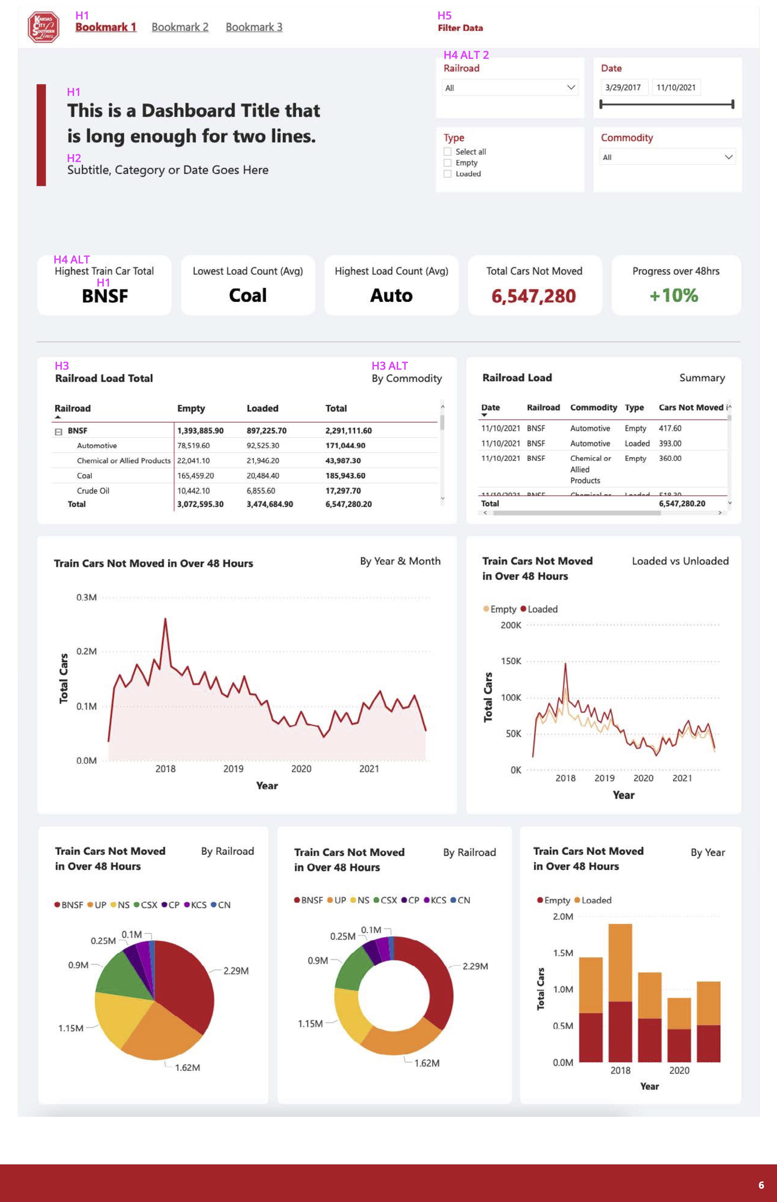
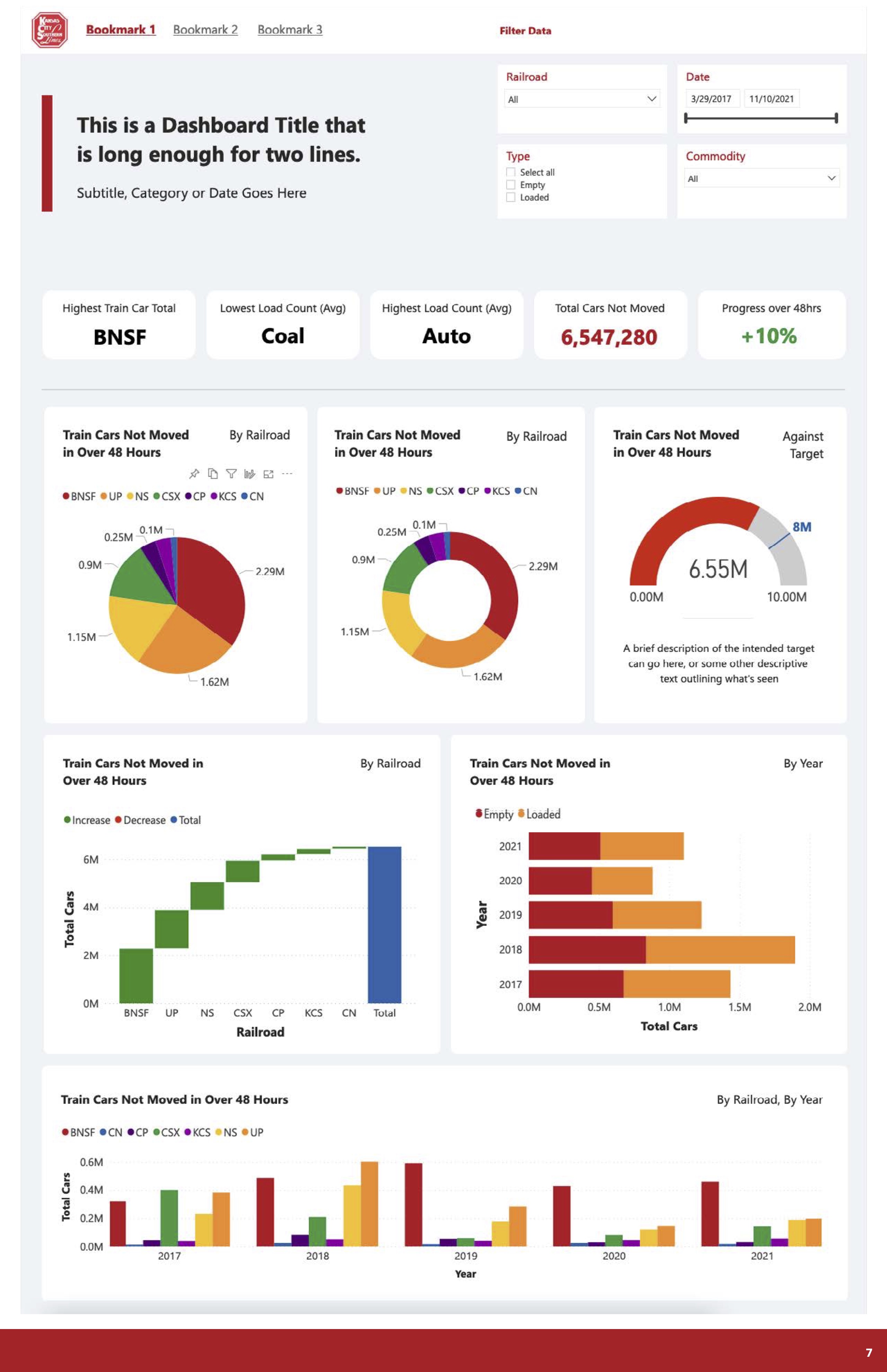
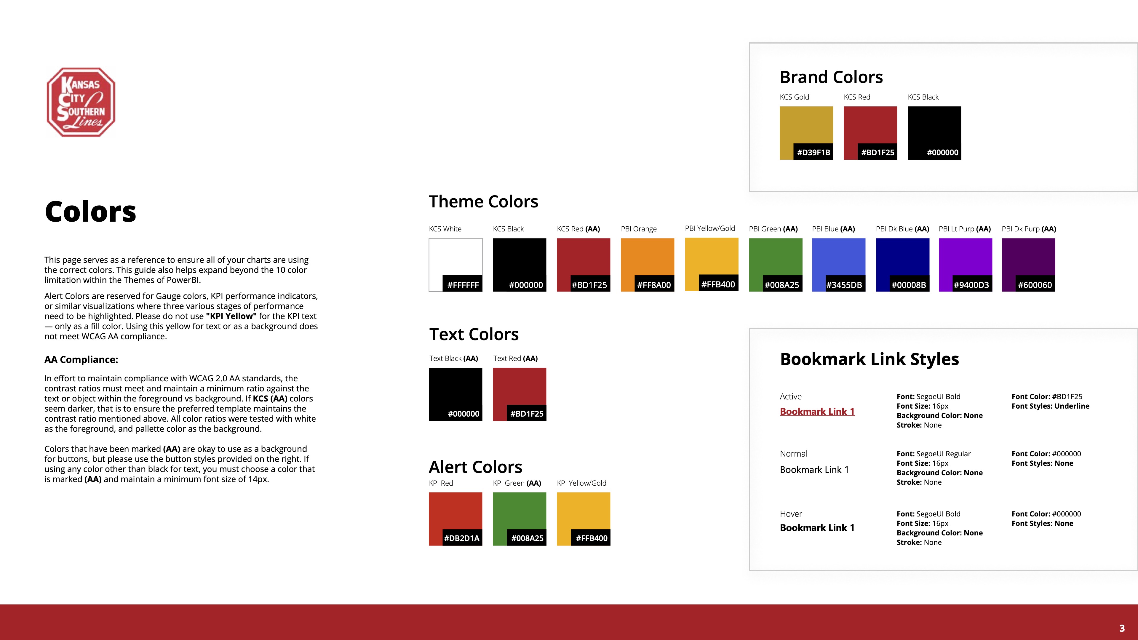
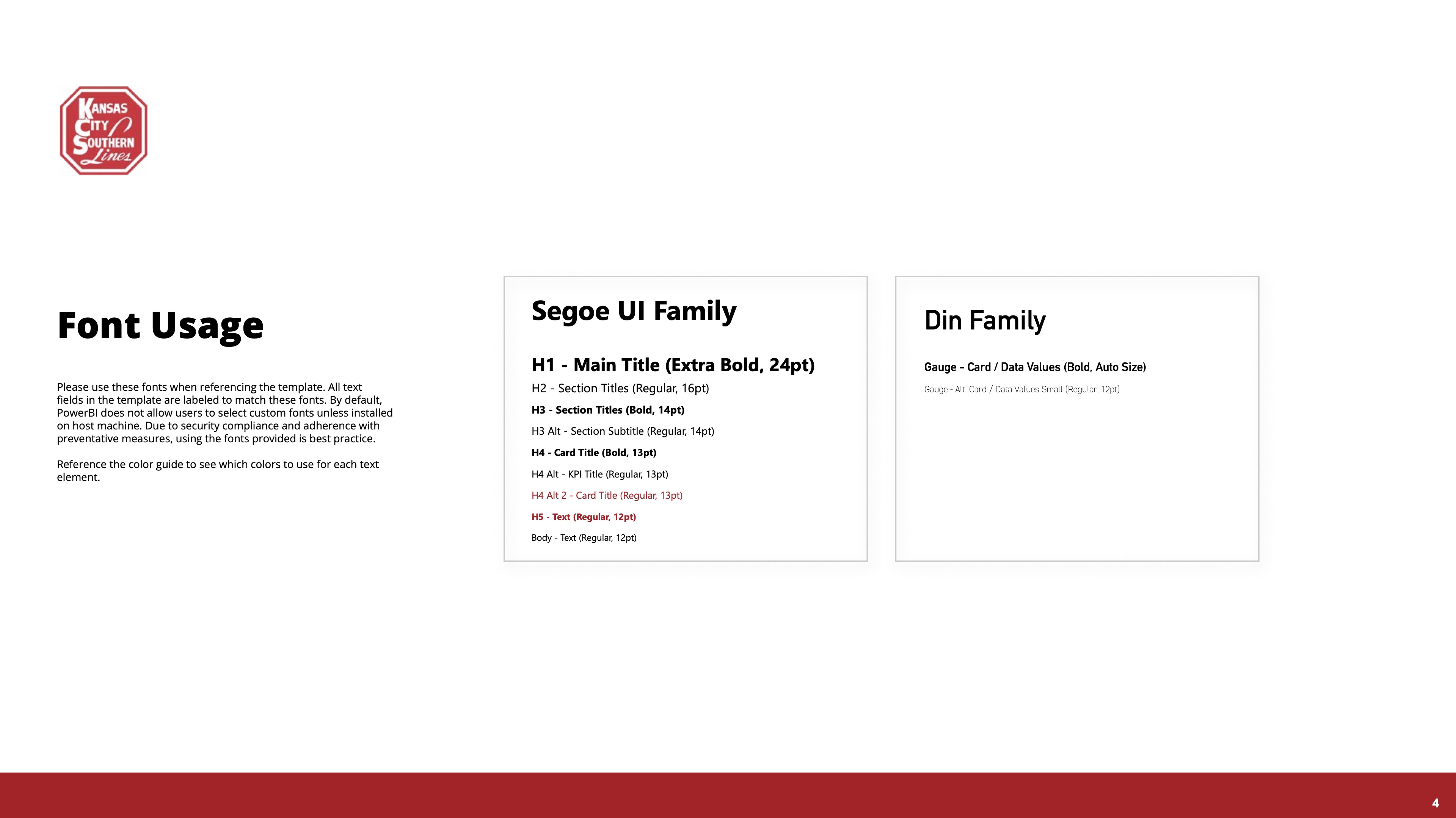
We established standards for theme colors and font usage.
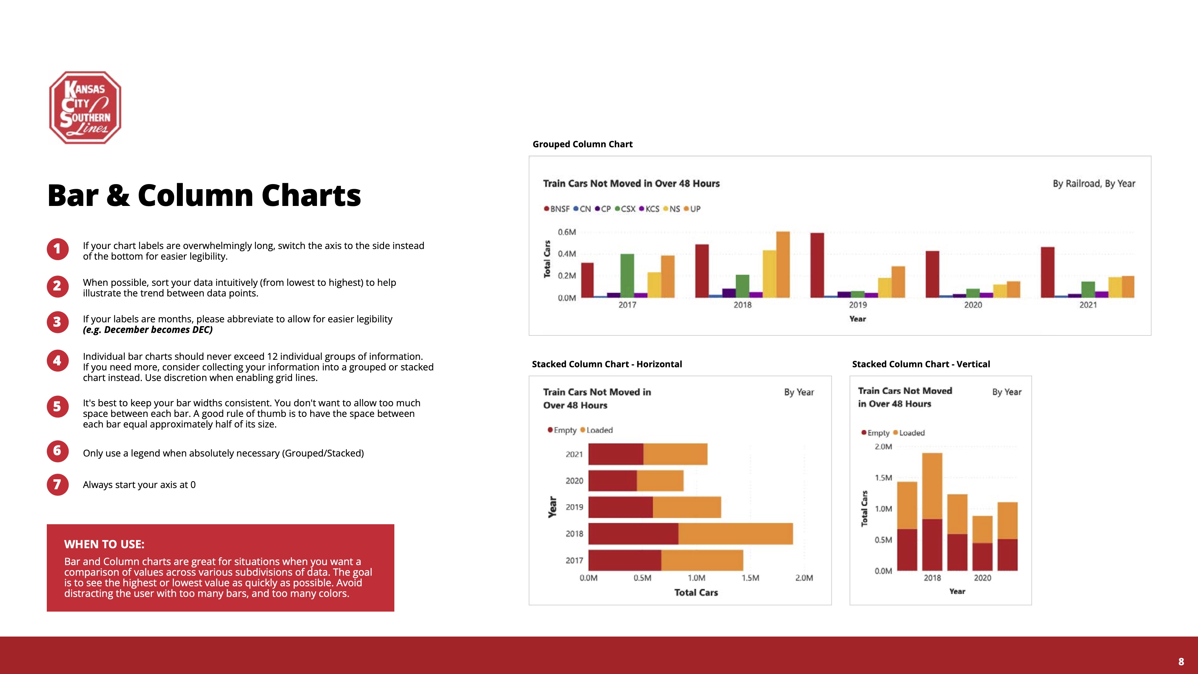
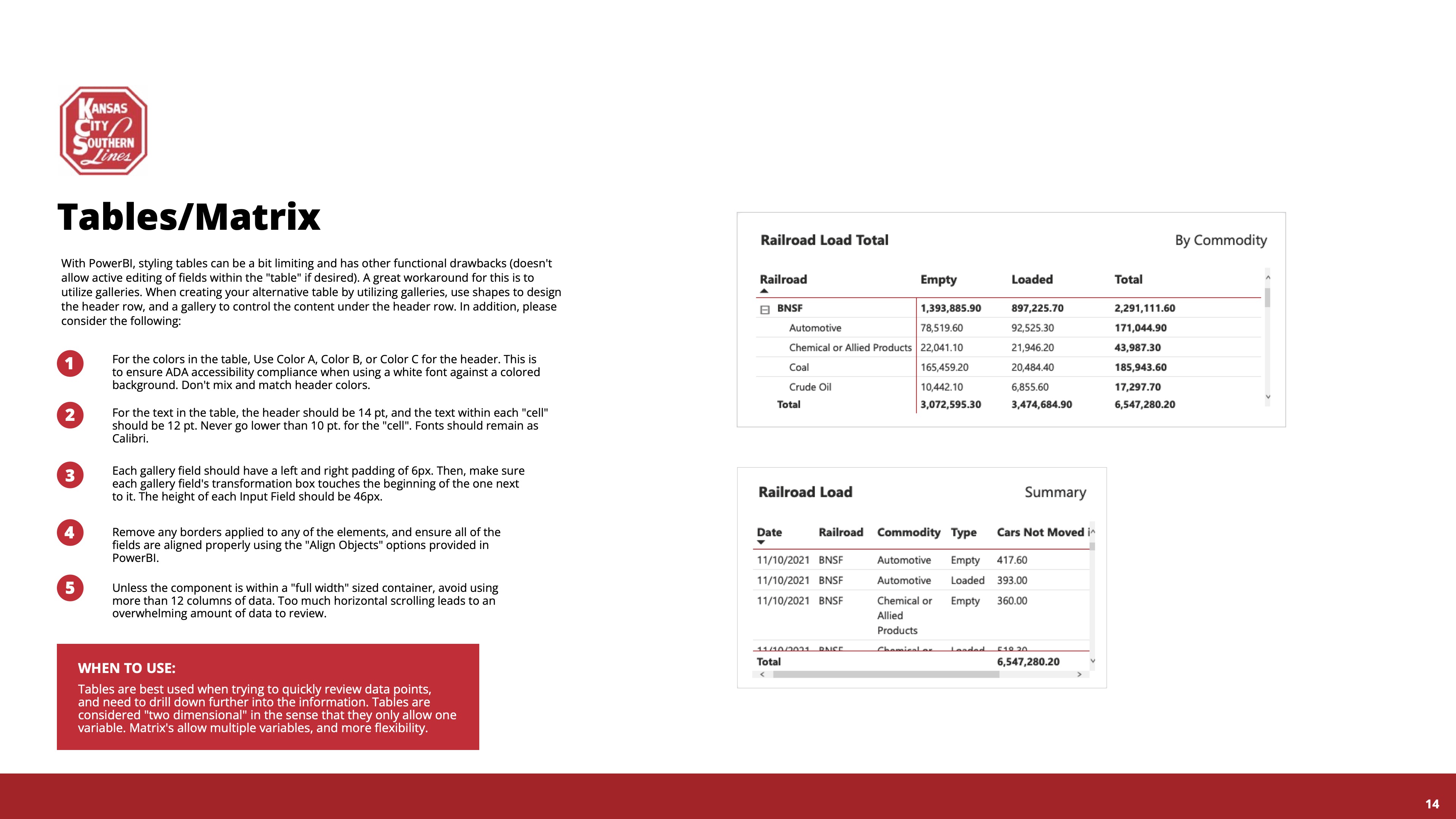
We also created standards for various types of data visualizations like Bar and Column Charts and Tables and Matrix layouts.
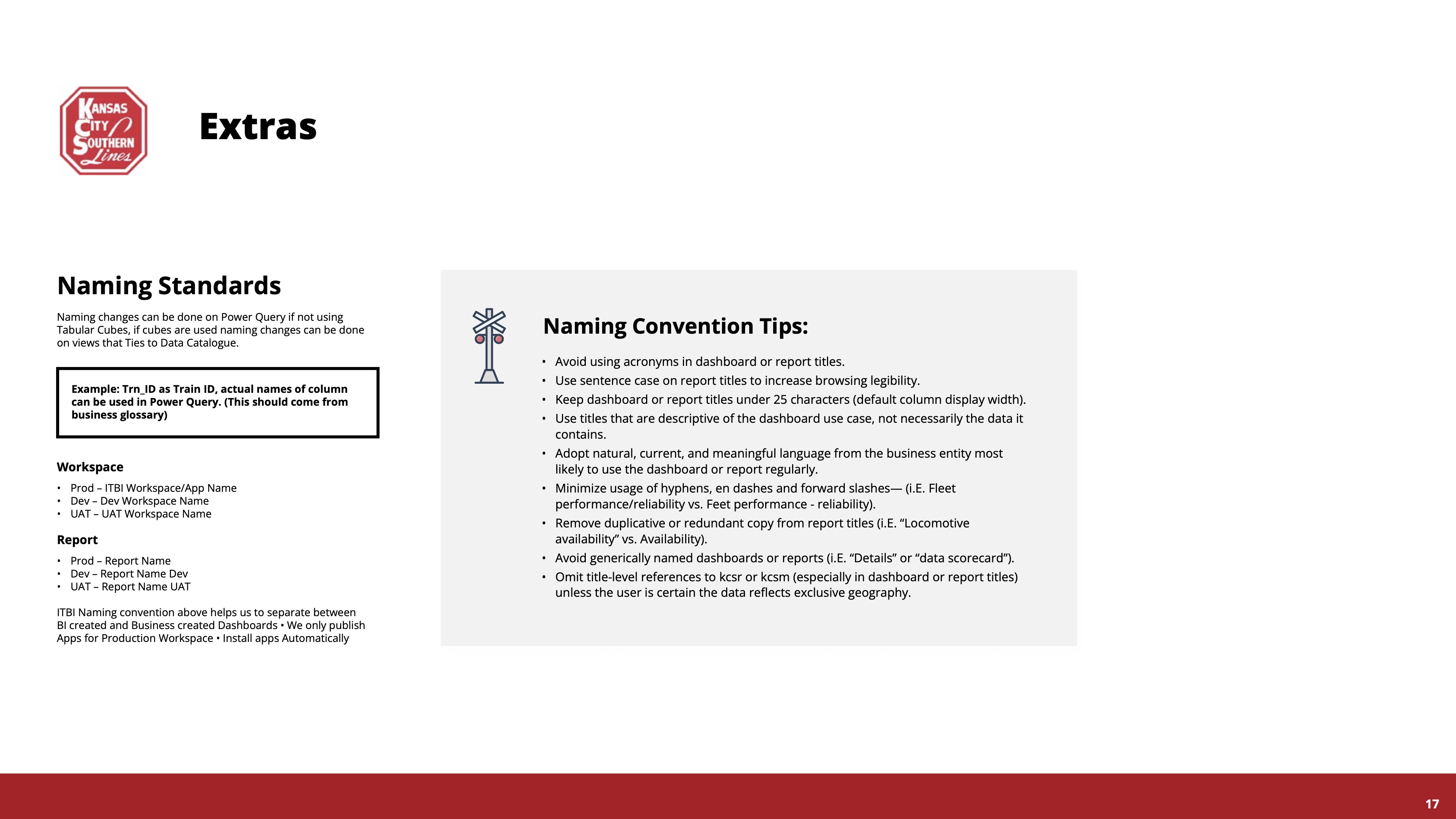
In an attempt to solve the perceived problem (on the basis of the ITBI team’s original hypothesis that users couldn’t find the data they needed in the system), we created clearer instructions for naming standards and conventions.
Let's work together.
I'm currently open to project-based or full-time experience design roles working with research and strategy-obsessed teams.