Website Engagement Optimization
- Design
- Research
- Strategy
Shows the ability to manage a complex customer listening project and design solutions that are tested and validated by multiple rounds of psychographic and behavioral customer research.
Project Summary
The project helped UMB’s marketing team in preparing for a CMS migration and a new website launch. It involved evaluating the existing site and conducting experiments to address hypotheses about information discoverability, navigation, search, and page layouts. The project terminated with handing off low-to-mid fidelity wireframes to the client’s big agency partner for final visual design and implementation by Q4 2023.
Roles and Responsibilities
Led agency design work for this project, all research and evaluation activities, and oversaw concept creation and testing of replacement wireframes based to support the most essential and common user tasks.
Heuristic Evaluation
- The project started with preliminary focus groups with site stakeholders to determine common tasks that site visitors would use the site to accomplish.
- The stakeholders’ input helped to generate a list of common user tasks.
- Produced a testing plan to exhaust all possible views related to those user journeys.
- Conducted a full-site heuristic evaluation using a modified framework for N/NG Usability Heuristics, including an evaluation of error severity (0-5), ease of fix (0-3), and detailed notes on each potential usability issue.
- Based on the heuristic evaluation alone, the client was able to revise navigation interaction patterns and the existing design language system to address major usability errors.
Stakeholder Alignment + Business Requirement Documentation
- An inventory was conducted of all existing content on the website, which consisted of 61 unique pages and 27 reusable components in eight distinct areas of the client’s business.
- Focus groups were held with stakeholders in each business area to validate perceptions about the relative importance of different content showcased on the site.
Information Architecture Research
- Tree tests and an open card sort were conducted to help answer the marketing team’s hypothesis about changes to content organization and navigation.
- Testers failed to correctly locate over half of the tasks.
Wire-framing, Prototyping, and Consumer Testing
- Over 120 hours of usability and customer preference testing were performed to build three different versions of the UMB website.
- Test versions included a slightly modified version of their existing site, an “ideal” site based on aspirational research, and research-based recommendations.
Major Challenges
❌ Poor Mobile Design
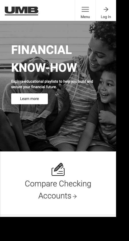
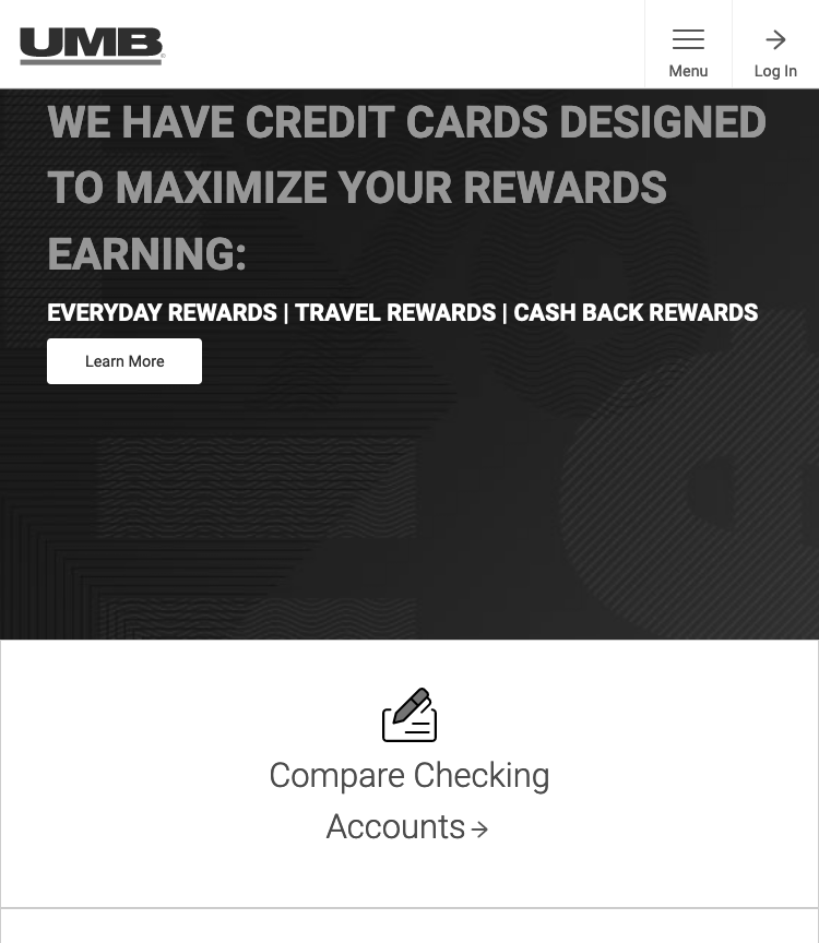
Many screens on the site had poor mobile design because they made it difficult for users to find the information they need and take the actions they want. The previous version of the site attempted to place immediate actions for users but the actions took up too much screen real estate and were confusing to users.

❌ Menu Usability Concerns
High Rates of Backtracking
UMB had evidence to suggest that the design of their menu was causing people to have to backtrack at high rates. We triangulated this hypothesis with a tree test (which proved that users couldn’t accurately predict paths using an interface-less version of their navigation structure) in addition to usability testing the existing menu with bank clients.
As far as we could tell no part of the UMB site had ever been designed mobile-first.
The mobile presentation was simply a poorly shrunken version of the desktop view which produced a scroll-heavy design reviled by users and stakeholders alike. The clickable area for the site menu was also way too small on some mobile devices, often producing usability errors during testing.
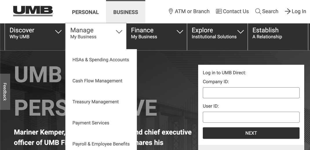
Users were forced to make too many guesses.
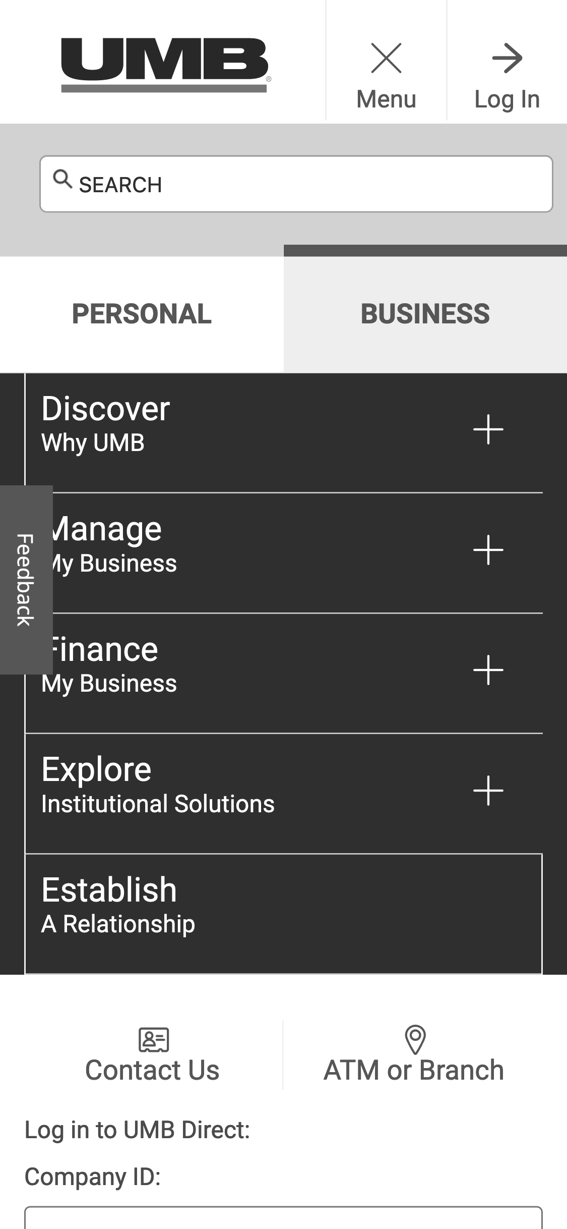
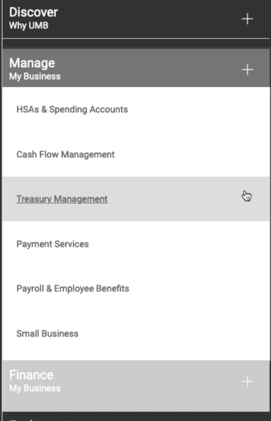
They needed to identify a “path” when they were looking for a product (i.e. selecting “Treasury Management” would provide only a subset of business products.” As such, in both views, users were forced to (1) open the site menu, (2) choose a category (they often selected the wrong category because of the over-written design), and (3) decide if the “line of business” page they selected would include the information they needed.
Testing helped us understand that presenting the user with categories like “Manage My Business” didn’t immediately signal to them which content (i.e. products) would be included under that subheading.
Users also didn’t recognize the difference between Personal and Business areas of the site.
Until they opened the full site menu on mobile, the distinction wouldn’t have been visible at all. When we asked users to search for business solutions they would frequently expand the personal menu and point to items under the “personal” subheading — they didn’t even notice there was a distinction.
In other words, the existing design asked users to understand the bank the way it understood itself.
The website was a perfect example of Conway’s Law— the idea that corporate websites end up looking like the internal communication structure of their organizations. Users repeatedly gave feedback that evidenced this point. Eventually, the project would gather enough psychographic research and user testing that the marketing team was able to build the argument for eliminating the distinctions between lines of business entirely.
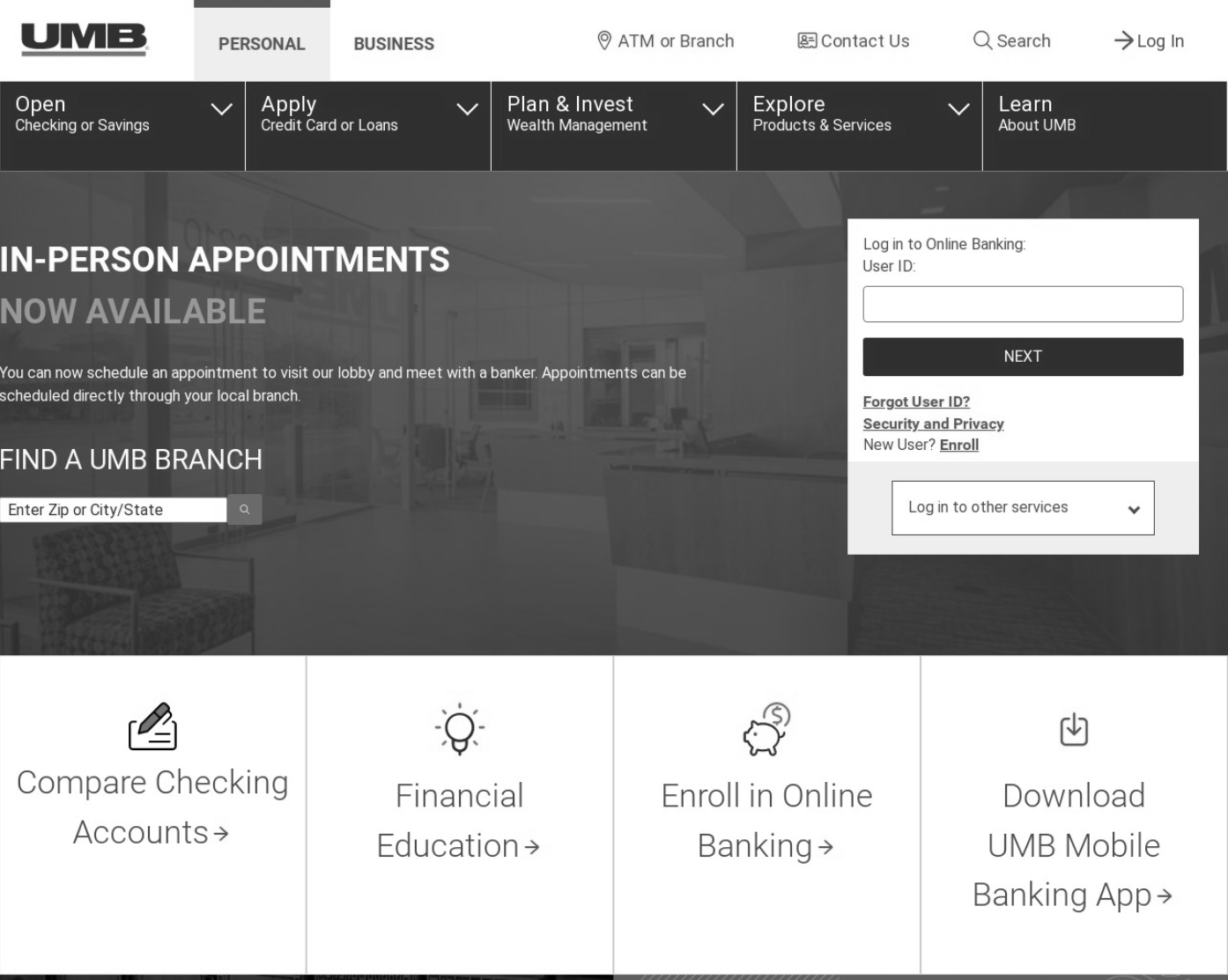
❌ Lack of Clear User Paths
Finally, testing revealed that nobody understood what to do with the big, blocky “suggested paths” on the home page. Users wondered whether this list was exhaustive. They said things like, “I can imagine coming to this site and needing to do something, just not these things. This would be frustrating to me.”
Wireframe Solutions
✅ Cleaned Up Version of the Existing Site (For Comparison Testing)
Establishing a Control
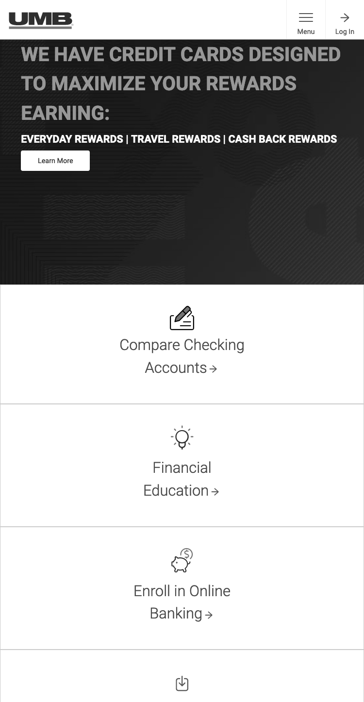
First, we created a cleaned-up version of the existing site as a control design for our impression-testing experiments. These examples show component-for-component remakes of the existing site. We used these designs to help determine if the structure of the existing site was less desirable than the proposed replacements or if the implementation of existing UI components (i.e. very poor mobile design) was responsible for user friction.
In this design, we made the key actions smaller (so that they would fit onto the initial load screen (i.e. “above the fold”), re-prioritized search, and made the login and menu buttons a bit more defined.
.png)
We also adopted a “Bank of America-looking” credit card feature to impression test with users and otherwise sharpened the visual design.
_Card.png)
✅ New All Products and Services Menu
Ultimately, we tested two different types of replacements for the blocky sit-menu. This one was the customer’s favorite. Rather than forcing users to guess which line of business subheading their product would be listed under, we produced a design that was product-focused from the very first click.
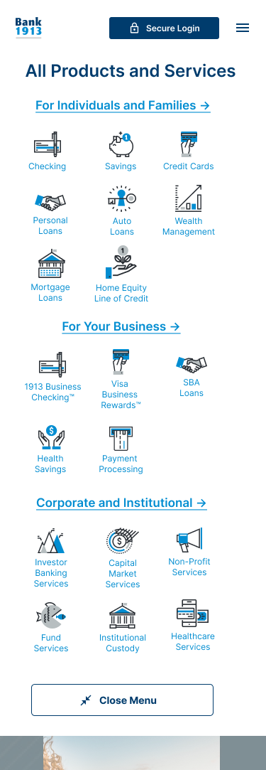
✅ We also built a handler option to help the user find exactly the content they needed from the beginning of the experience.
We reprioritized the required content from the business leaders (i.e. Open an Account Now) as the primary action item on the landing page. We also worked with stakeholders to develop a drop-down handler that would allow the user to select a product (i.e. loan, account, etc.) + and a goal (i.e. open an account, get more information, speak to an agent).

The final mobile design featured a single dropdown (most users couldn’t wrap their heads around the idea of interacting with a handler to interact with “X in order to Y”), so we changed the design to feature a new product menu if the user interacted with the “For Everyone” toggle.
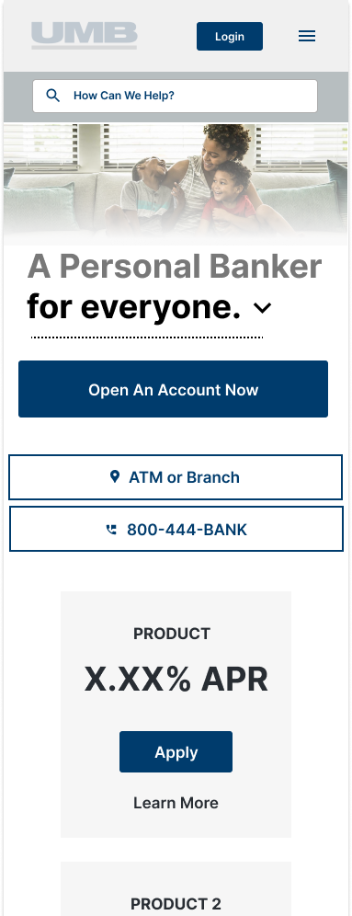
The final home page design highly prioritized the search feature and responsive product features/filtering because:
- The new CMS was able to handle a significantly more powerful site search algorithm.
- We learned during customer testing that users preferred a search-focused design.
- We knew from other customer research that search-focused designs are (generally) super user-friendly.
- That the business requirements for technical components of the new system had enough analytics and user tracking embedded (outside the purview of our project) to selectively feature items that returning users might want to see— so we skipped all the “line of business” navigation non-sense and made the website 100% about allowing the user to locate products and services from the home page.
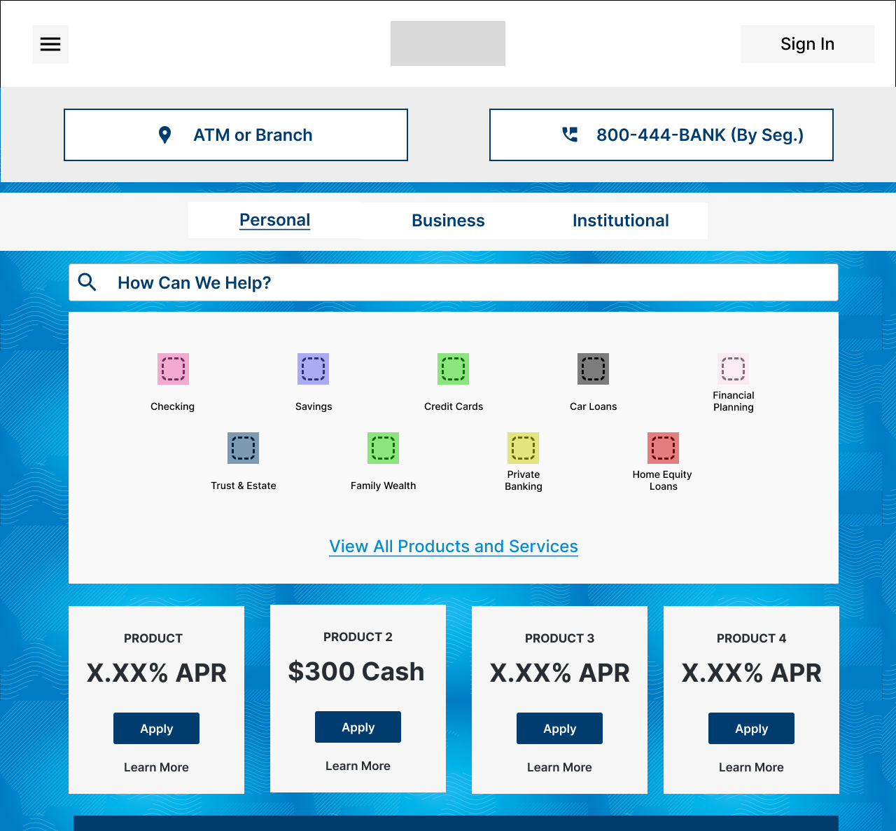
This is an example of the way the “Institutional” service line page looked before— users repeatedly told us that they didn’t feel like they could find products, they said things like, “I thought I already selected which category I was in, I just want to see products…”
_Desktop.png)
_Full%20Desktop.png)
We produced a compatible design that featured the products and services (and met business requirements) that allowed users to prominently locate the search feature near the top of the page or to identify their specific product use case (i.e. Banks and Financial Services, Corporations, Education and Government, etc.). These user choices could be saved by the system to better display products customers would like later in their user journey.
_Top_Desktop.png)
_Full%20Page.png)
Let's work together.
I'm currently open to project-based or full-time experience design roles working with research and strategy-obsessed teams.