Scratch Donor Experience Portal
- Design
- Research
- Strategy
Displays an aptitude for listening to stakeholders, aligning business requirements, and adjusting UX strategy in the context of a dynamic, multi-faceted project.
Summary
This is a case study about a project that I completed for Unbound.org, a charity that helps families living in poverty become self-sufficient. The project involved end-to-end design for the website and donor management component, from customer discovery to developer handoff. The portal connects 280K sponsors with sponsored friends and has distributed over $2B in funds to help families overcome poverty.
Roles and Responsibilities
Customer Discovery
The discovery phase involved conducting fifteen interviews to understand the strengths of the existing site experience, identify pain points and opportunities for improvement, and validate users’ navigation patterns.
Information Architecture
A remote-moderated card sort was conducted with 25 participants. Each participant sorted 47 cards into groups that made sense to them, using 10 content categories. After sorting, participants evaluated the category titles and made adjustments as necessary.
User Tests w/ Interactive Prototype (Figma)
Twelve user tests were conducted to pressure test three key areas of the proposed new design. Participants were asked to use the prototype to select someone to sponsor, check out, and complete representative tasks such as making a payment, updating a credit card, setting up AutoPay, increasing a donation, and canceling sponsorship from the home page.
Final Visual Design (Figma)
The final visual design incorporated insights from user testing and client feedback— the Figma prototype was then updated to reflect these changes, in preparation for the handoff to the client’s chosen web development partner.
Client Goals and Project Impact
Increase sponsorship and donation conversions by making the selection of a sponsored friend a more dynamic experience.
Early feedback from donors revealed that many users were confused about searching for and selecting sponsored friends on the site. A majority of users (75%) could not demonstrate how to use the toggle feature to browse, and almost all users were frustrated with the mechanics of the search feature. Users often had difficulty finding someone to sponsor and/or didn’t trust the results provided by the system. When users could find a friend they were interested in sponsoring, they felt that the information presented to them was incomplete and insufficient, and they wanted more detailed profiles. The majority of users said they would make a phone call to Unbound to select a new friend and preferred not to use the system (at all) to select a sponsored friend.
Improve user engagement with dynamic and compelling content about sponsored friends.
Psychographic research revealed that users desired to view several pictures of potential sponsored friends simultaneously and preferred to browse through a large number of options quickly. Users expressed the need for more comprehensive information about potential sponsored friends, which they envisioned as being similar to a social media profile.
Support the sponsors and sponsored friends relationship.
The sponsor dashboard was not meeting the needs of sponsors who wanted a comprehensive online experience. Due to COVID-19 postal mail limitations, Unbound prioritized the MVP of their online letter-writing features. The new sponsorship experience provided a dashboard that emphasized donor relationships, encouraged letter-writing, and provided contextual notifications for received letters.
Build loyalty with the Unbound brand by providing a modern eCommerce sponsorship management experience.
Existing sponsors found the sponsorship dashboard confusing and text-heavy. They only used it when their credit card expired or when they had to make a payment. The Unbound call center reported high call volumes due to users struggling with basic tasks such as changing a payment method or payment frequency. To address this, the proposed designs added interaction patterns to encourage users to turn on auto-pay.
Solution Showcase
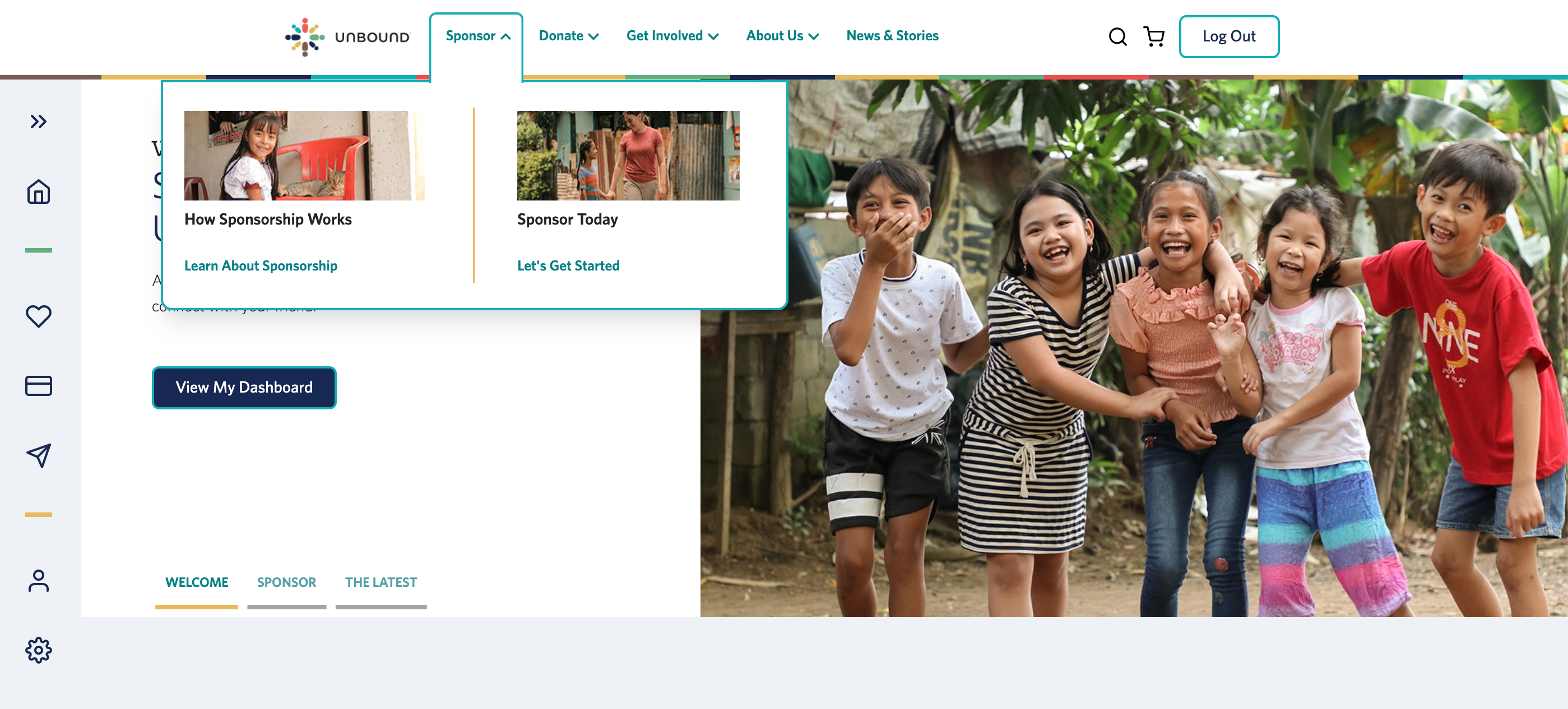
❌ Users found the main navigation to be confusing.

Test users had trouble understanding the multi-tier navigation. Notable issues included:
- not being able to quickly locate Login or Search features;
- user complaints that they didn’t understand enough about the sub-selection to feel confident making a choice (i.e. horizontal orientation of sub-menu);
- generally negative user reactions to the UI (i.e. application of brand colors in a way that wasn’t WCAG contrast compliant).
✅ We solved this problem by reconfiguring the UI of the menu and the content categories.
The card sort helps us identify new content categories (Sponsor, Donate, Get Involved, About Us, and News + Stories). We solved the problem of color contrast by lightening the color of the menu and creating a more coherent architecture that would accommodate content (vertical) content growth.
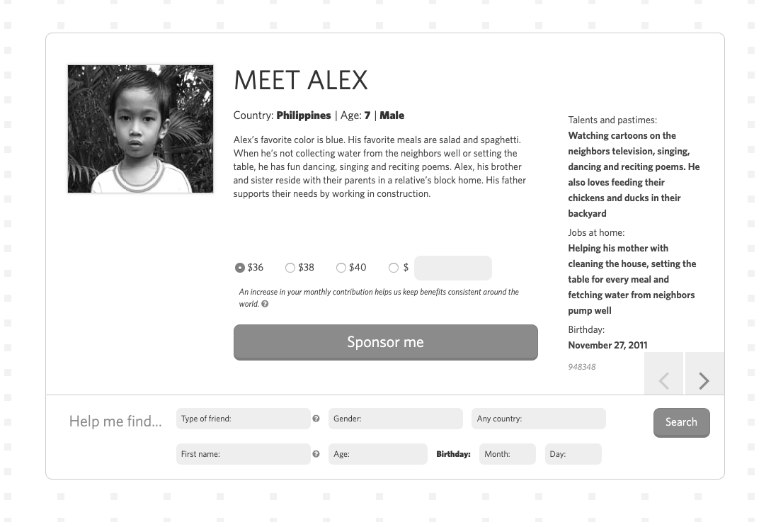
❌ Users didn’t understand how to interact with the friend selection handler.
The initial design that we tested didn’t have a proper “search” feature for selecting a child or elder to sponsor— it simply was a piece of content that lived on the home page underneath the splash image. Its location and design produced several usability problems:
- Users felt like there should be more information about the candidate for sponsorship.
- Users weren’t ready to sponsor a child based on this “layer” of information.
- Users didn’t know how to toggle from one candidate for sponsorship to the next (bottom right).
- Users didn’t understand how to use the search feature below the profile.
- The primary heuristic this design violated was that users expected to see more than 1 person paired with a “search feature” as they traditionally understood it.
✅ We solved this problem by designing a new search experience.
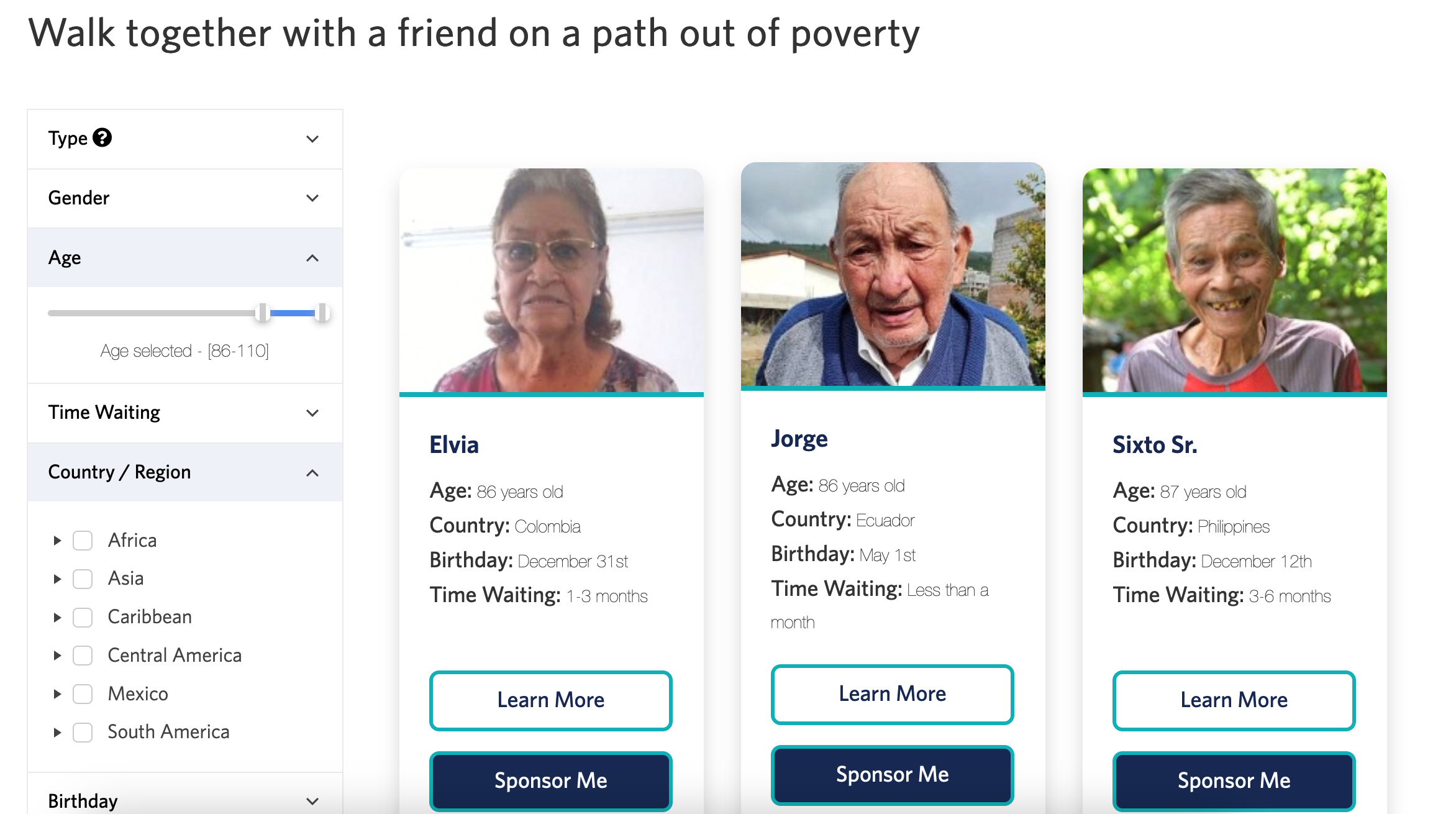
The new search experience prioritized the display of multiple results at one time and included a choice to sponsor from the search handler or [Learn More] to visit the profile page.
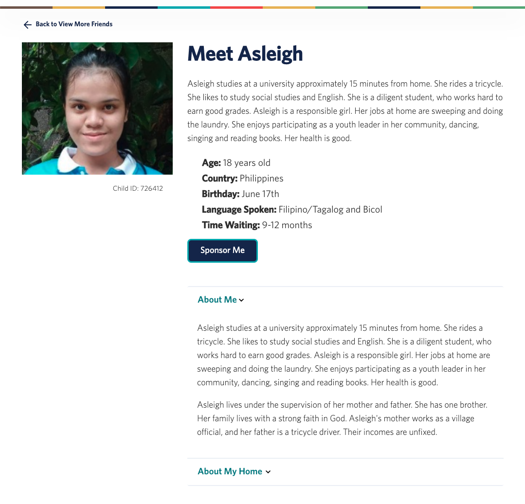
The new search took the user’s focus to a page that included information only about the potential candidate for sponsorship that they had selected.
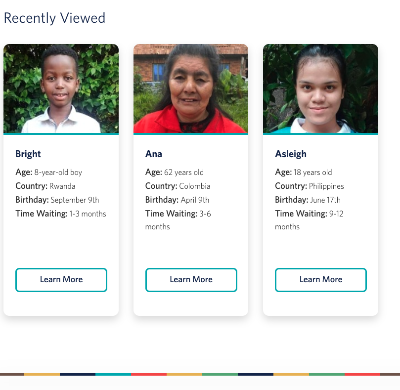
We also included a “recently viewed” section below the search results to remind users which friends they had considered previously, which answered a significant experience problem with the previous design— users were previously unable to “find” someone they had viewed in a vast database— something they described as “like finding a needle in a haystack.”
❌ Donors described the existing dashboard as visually unappealing, difficult to navigate, and (overall) confusing.
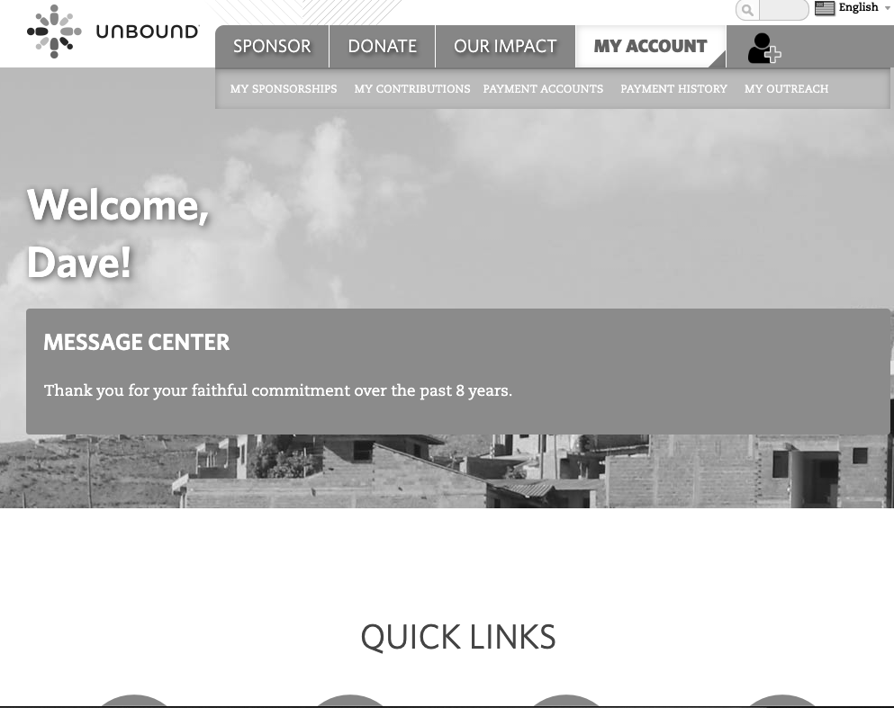
Donors didn’t understand the difference between “My Sponsorships” and “My Donations”— they viewed their sponsorships as donations.
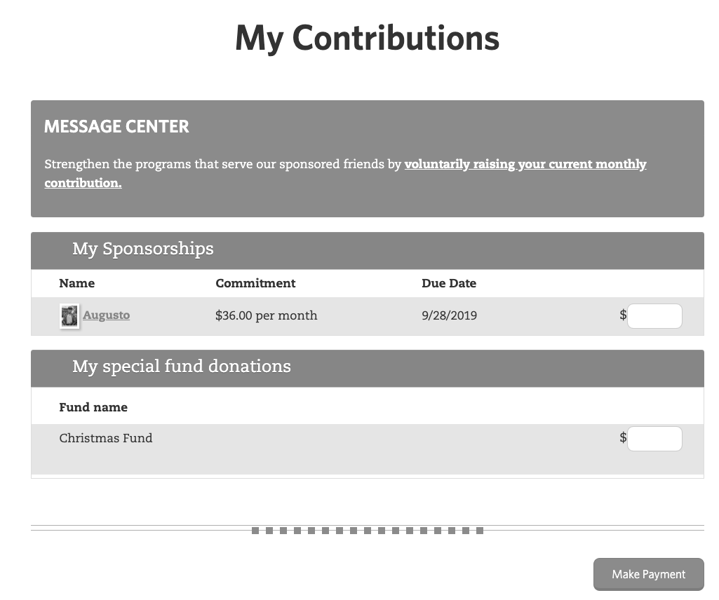
If a user didn’t have their account manually setup by Unbound to automatically draw a payment every month, users had to log in and physically enter an amount (based on their commitment amount).
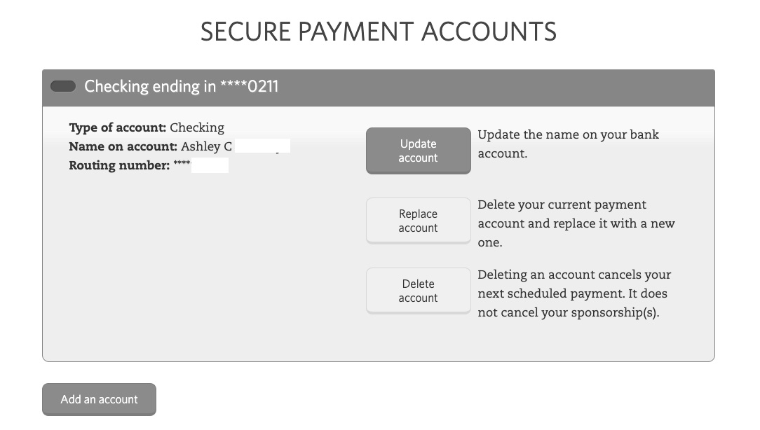
We learned during user testing that lots of sponsors used different payment methods to pay for multiple sponsorships. Many of our test users couldn’t figure out how the system understood their payment cards as being separate from their sponsorship commitments.
✅ We solved this problem by designing a new Payment Information dashboard.
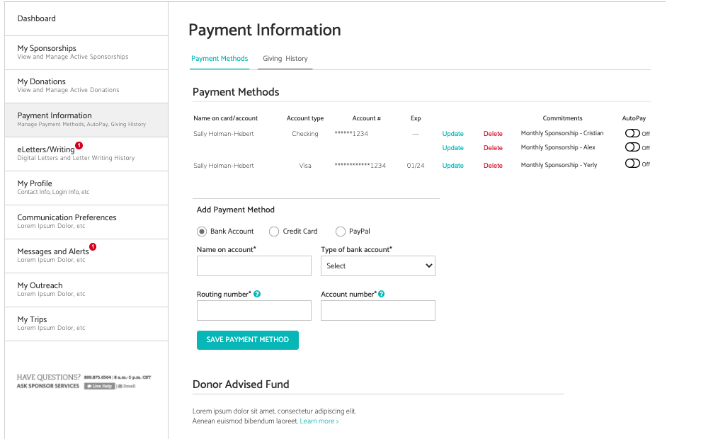
This was the initial solution that was proposed— but it produced somewhat significant usability issues during user testing and the business team changed the requirements for cards to require that the user contact Unbound by phone to delete a card from a sponsorship.
In other words, there was no longer a need for a “payment information” section— Unbound needed to clearly provide users with a way to associate a card with an ongoing pledge but didn’t want to give users the ability to manage cards separately.
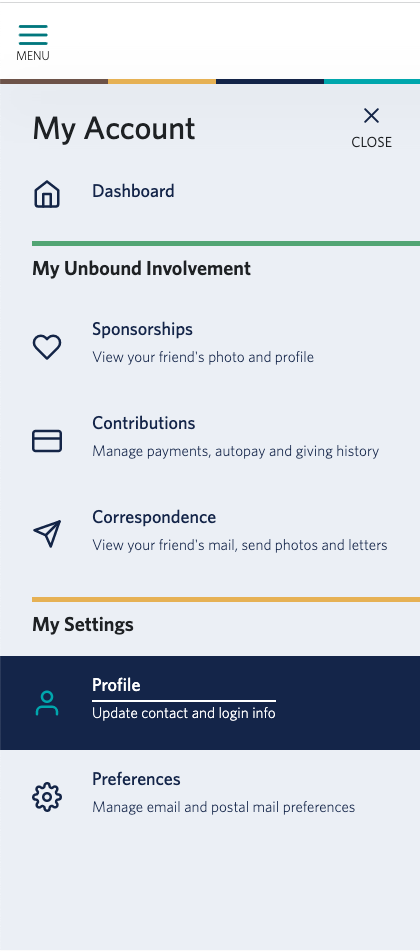
We solved the problem of dashboard navigation by creating a side-bar experience (in place of the traditional top-level navigation) for logged in users.
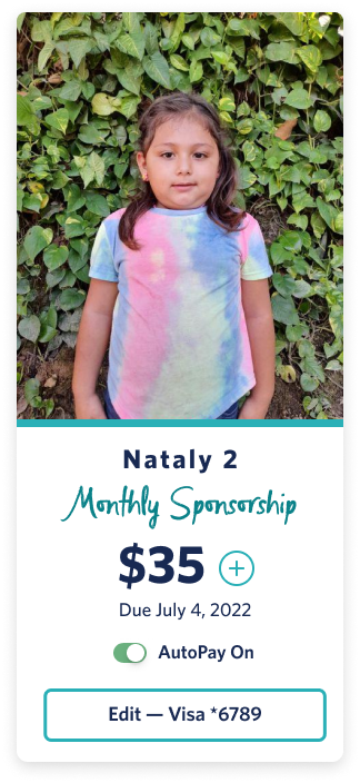
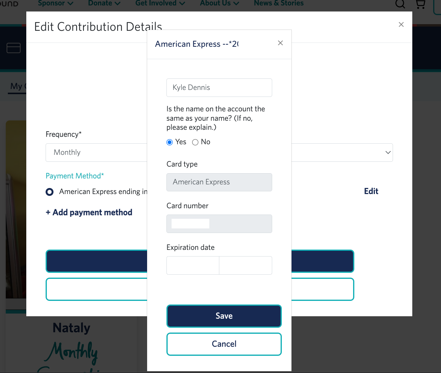
When the user clicks the “Edit Visa” option, they’re presented with a simple handler that allows them to modify frequency of payment, add a new payment method, or edit their existing one.
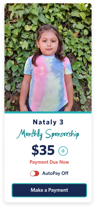
We created a new mobile-first design for the sponsorship cards that combined previous features (like increasing sponsorship, turning on AutoPay, and making a one-time payment) with a handler that would clearly show the user that they had a payment method attached to a sponsorship commitment.
Nataly is the actual child my family decided to sponsor over the course of this project.
.jpg)
Let's work together.
I'm currently open to project-based or full-time experience design roles working with research and strategy-obsessed teams.