Non-Profit Navigation
- Design
- Strategy
Highlights an ability to prioritize, plan and execute a high-impact interface solution in the context of an extremely limited-scope engagement.
Summary
Veterans Community Project was founded in 2016 and is a nationally renowned 501c3 organization focused on building tiny house communities for Veterans of the US armed services. This project was completed as part of a Pro Bono agency engagement with VCP, serving as the Lead UX designer and front-end developer on the client’s WIX site for a three-month site refresh project that took approximately 75 hours to execute from planning through delivery.
Roles and Responsibilities
- Candidly, this project is intended to be a stop-gap measure that would help the organization meet the challenges of ongoing, rapid site expansion while planned for a purpose-built site with an anticipated launch date of Q4 2023 - Q1 2024.
- The project includes taking inventory of the content on the entire site to evaluate and reorganize navigation architecture, wire-framing potential solutions to experience challenges, and executing the marketing team’s vision within the parameters of their existing WIX site.
Problem
❌ The site navigation was confusing to users who needed information about specific sites.
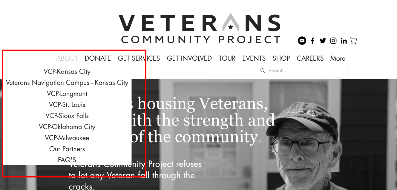
The primary challenge we needed to solve was that the existing site design didn’t effectively showcase national expansion locations. If a someone needed to contact a VCP village site in South Dakota, they didn’t need to see any information about the veteran village in Kansas City.
Stakeholders at village sites outside of Kansas City felt left out and like the site navigation didn’t acknowledge their existence. Since the marketing team didn’t want to exacerbate an already crowded navigation menu, they added each village site as a vertical dropdown under the “About” section.
Another substantial confusion was that the “Get Services” (technically) only applied to the Veteran Village in Kansas City (since the majority of expansion locations were yet to offer VCP’s wrap-around support services). This led to confusion on behalf of users and caused the staff in Kansas City to receive veteran service requests from people outside of the Kansas City metro area.
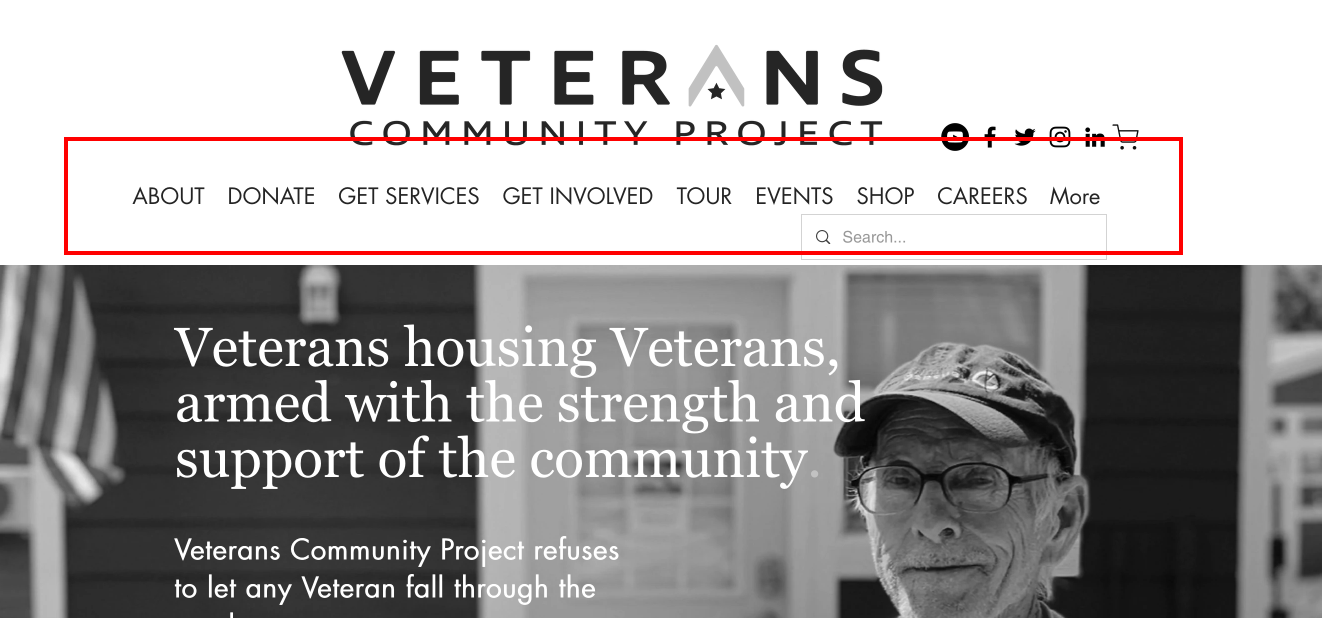
Users also frequently mistook the “Careers” category as an area that posted jobs for homeless veterans— instead, it was intended to share information about jobs available at the VCP national office. The main splash presentation (white text on picture) also failed WCAG requirements for AAA contrast ratios.
The site footer also included address information about the national headquarters in Kansas City— the design didn’t do anything to communicate to users that they were on a “national HQ” page.

Solutions
✅ Information Architecture
We took inventory of all of the existing content on the site and produced a visual site map to engage stakeholders about which areas they felt comfortable de-emphasizing and removing from the primary nav bar so that we could de-clutter the initial presentation of the site.
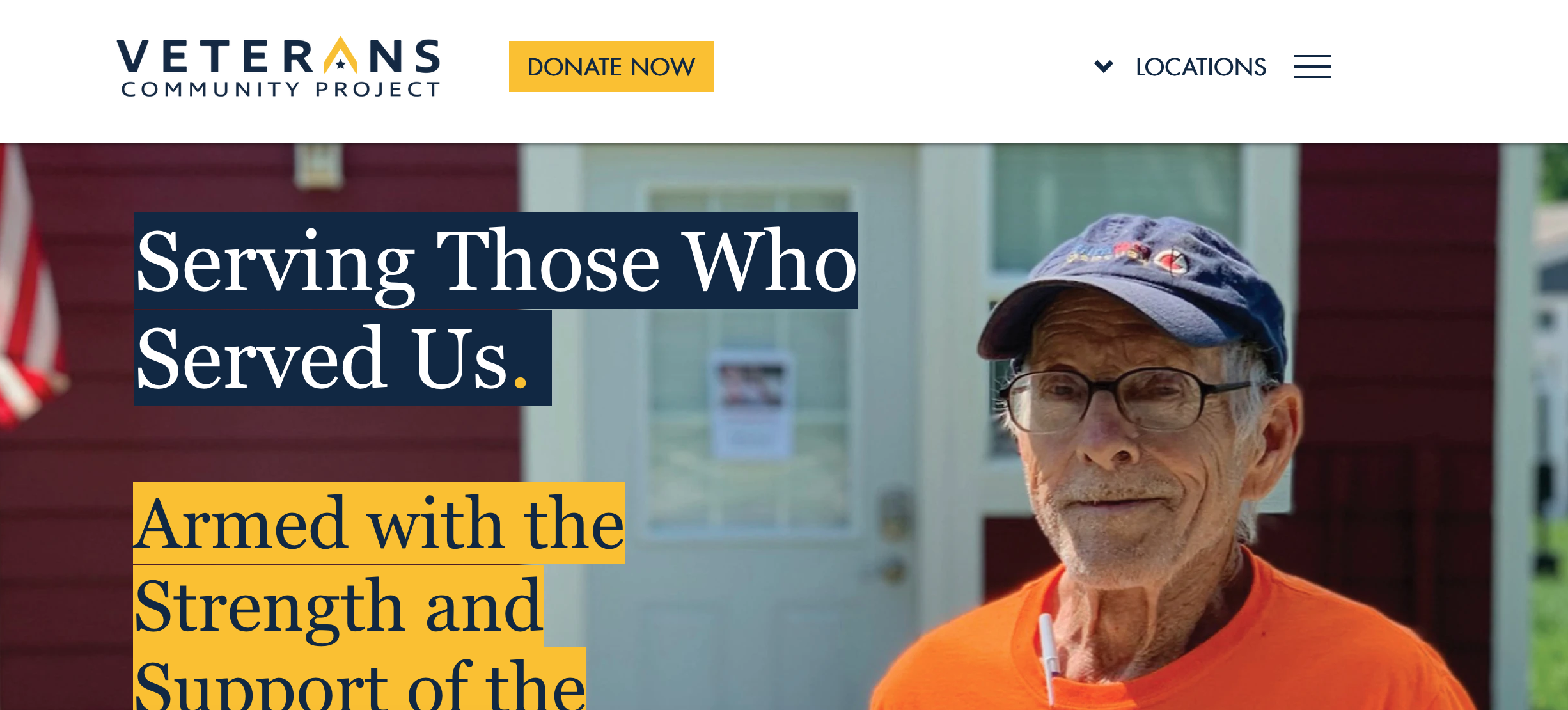
✅ Prioritization of Donate Now Button
Business stakeholders wanted the landing experience to include a clear path to donate to VCP— cleaning up the cluttered header allows us to present a clear donate CTA in the sitewide header.
✅ Updated Splash H1 and H2
The new design ensures VCP’s compliance with AAA contrast ratio requirements by avoiding legibility issues produced in the previous design by the white text being laid over a background photograph.
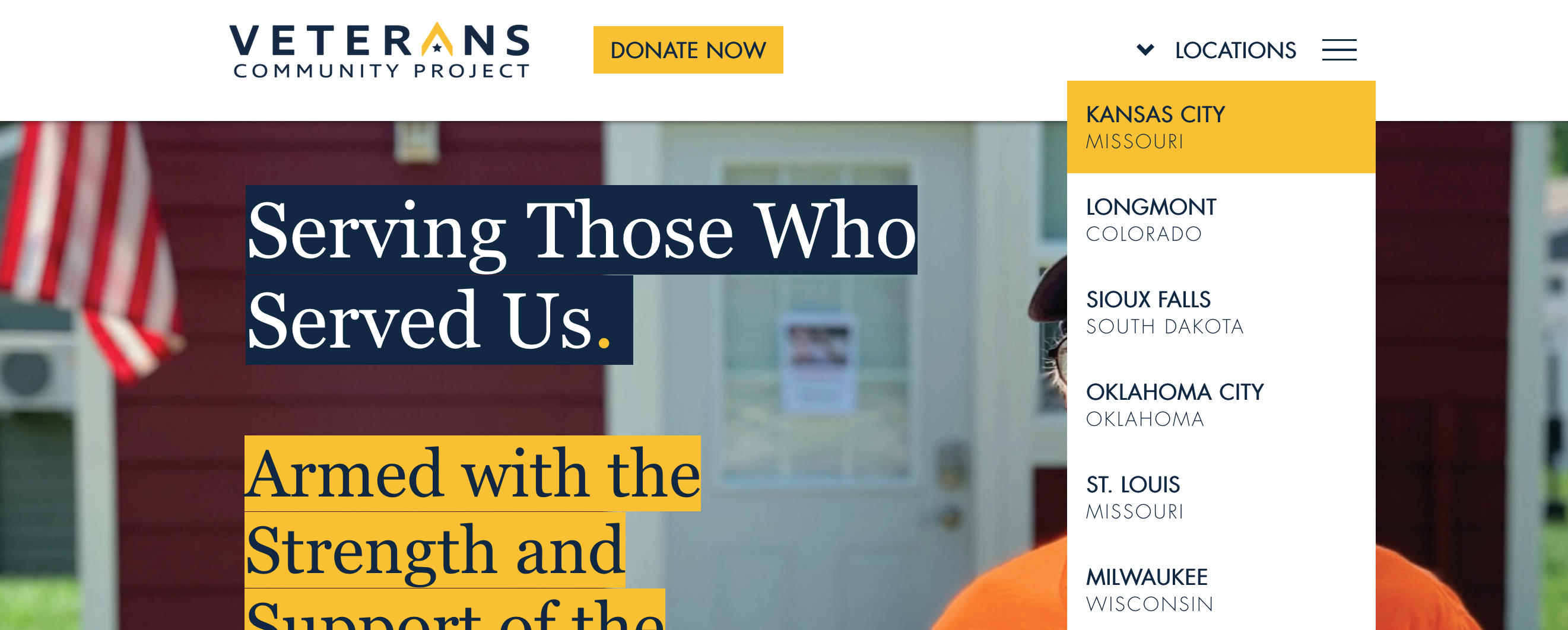
✅ Custom Menu for Village Locations Dropdown
The client’s out-of-the-box WIX site wasn’t equipped to include two different menus, so we designed a solution that would let us use one dropdown and one site menu.
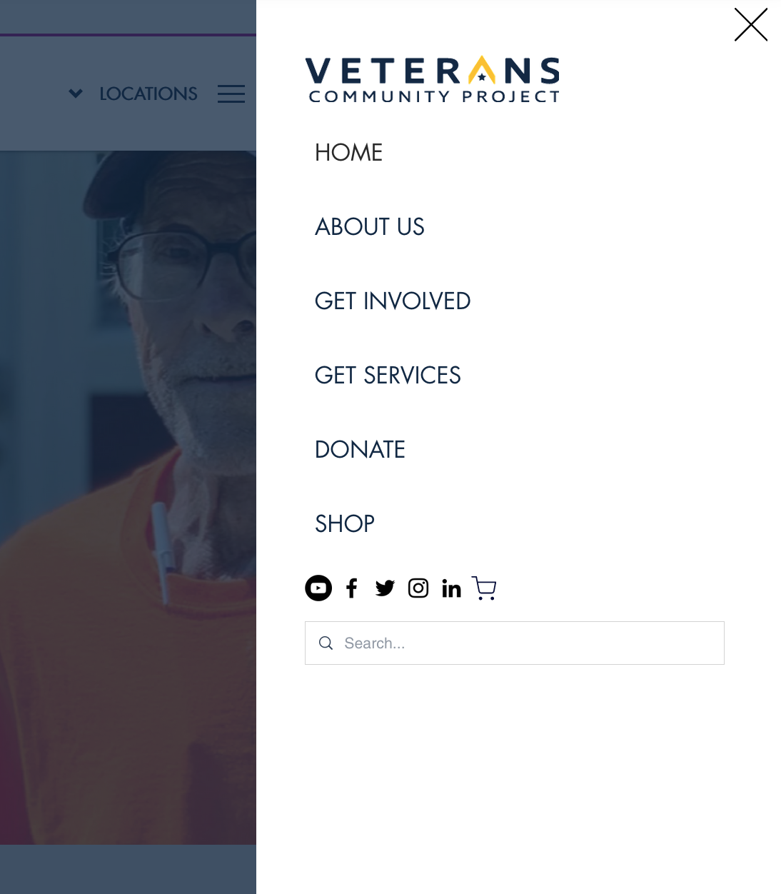
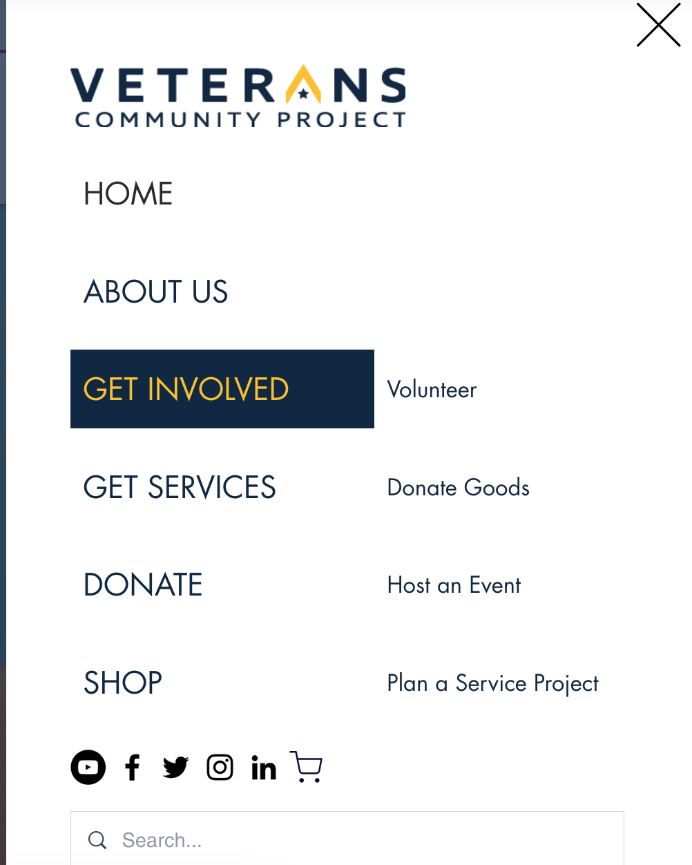
✅ Addition of Collapsed Site-Wide Menu
Understanding the organizational priorities for the site allowed the project to offer a solution that unfurled most of the information users would around a common, predictable site menu interaction pattern than unfurled information by using more accurate categories (i.e. Get Involved > Volunteer).
✅ Modification to Site Footer to Serve as Secondary Navigation
We solved the “Kansas City” focus problem (in addition to helping with our crowded navigation problem) by clearly labeling the site’s Kansas City address as the National Headquarters and demoting some links to national organization content.

Let's work together.
I'm currently open to project-based or full-time experience design roles working with research and strategy-obsessed teams.